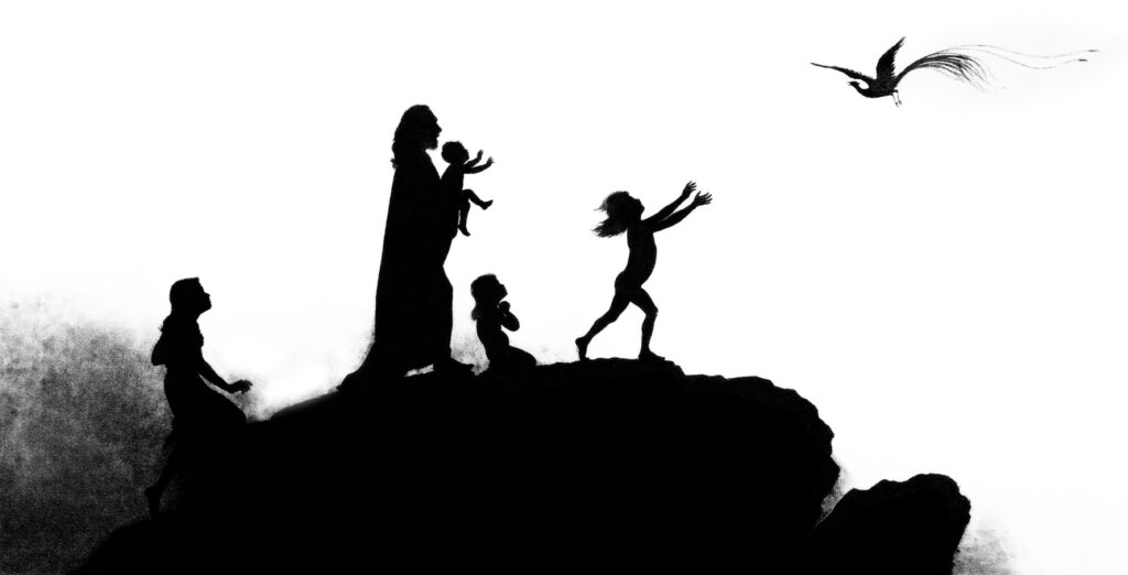
The complete silhouette illustration by the German Symbolist master Karl Wilhelm Diefenbach, assembled as one ultra-wide image. “Per Aspera Ad Astra” (“Through Hardship to the Stars”) is a complex, striking and joyful work defying easy explanation. Diefenbach himself was an untethered, original thinker–Theosophist, Symbolist, Naturist, Himself-ist–perhaps best summed up in the paradox that virtue pushed past reason becomes vice. The silhouette procession of children, animals and much more was originally a 68 meter long frieze, designed in 1875 and executed by Diefenbach’s protegé Hugo Höppener (“Fidus”) while Diefenbach was in a sanitarium. It was adapted into a book of 34 illustrations by 1893, scans of which can be found on the Commons along with more of Diefenbach’s work.
The images for download here are from these scans, matched and straightened nondestructively with hand cleanup, into a 2.9GB greyscale 172,058 x 2,473 px Large Document Format file.
The scrolling YouTube video (above) is probably the easiest viewing method right now. Be sure to set the quality to full 1080p60 and go fullscreen.
The TIFF is 110MB, full sized (172058 x 2473 px) and may be compatible with more software. I’d recommend downloading the zip file, as trying to render the TIFF might crash your browser.
The PNG is full sized and only 67MB, but may be harder to decompress. Same browser warnings.
The JPEG is 6MB, scaled down to 64,000 x 920 px (the max for the file format).
First panel
Information in English is hard to find. “Per Aspera Ad Astra” sometimes seems to be confused with “Kindermusik” (“Children’s Music”) a different series sharing themes and at least one figure. Diefenbach spent many of his later years on Capri, where there is a museum dedicated to his surviving works. (Too few, sadly.) His reputation improved by the passing century, the original 68 meter frieze of “Per Aspera Ad Astra” is now on display in the town of his birth at the City Museum Hadamar.
Please note that this assembled version should not be considered a “transformative work” for purposes of copyright, so the image files here are in the public domain. I don’t currently have the storage and bandwidth on SpaceToast.net to host the original file, but if you’d like to work with it please contact me through the About page and we’ll figure out a way to get it to you.
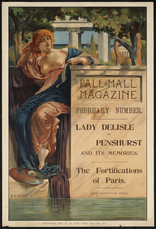
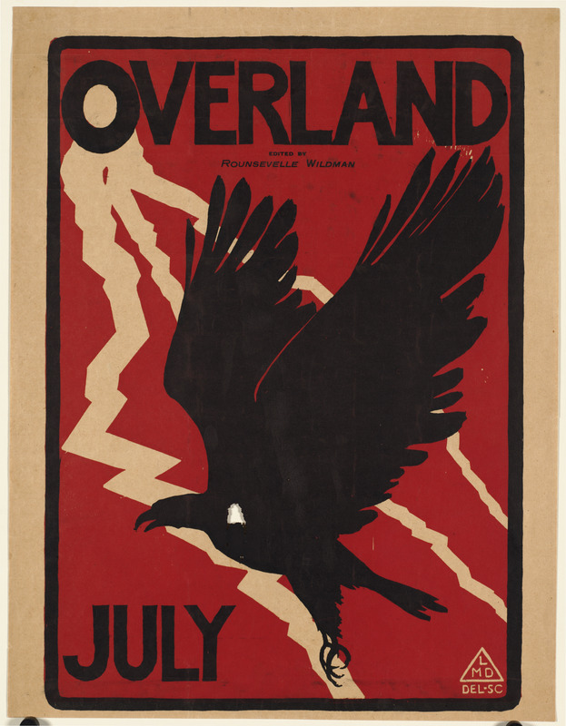
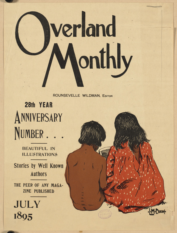
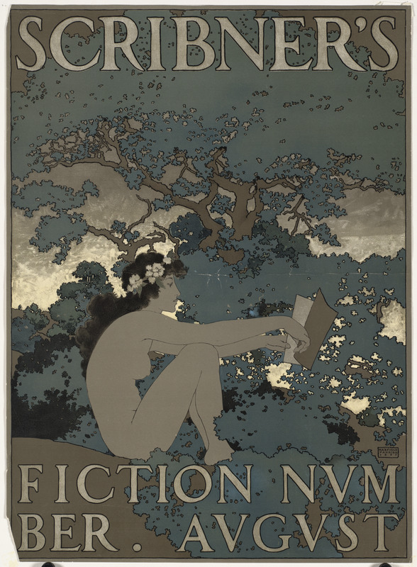
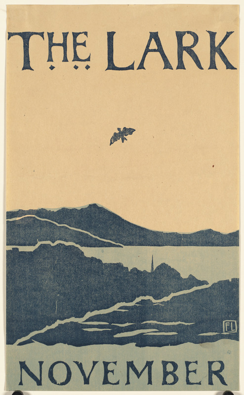
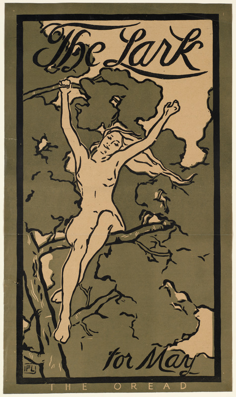
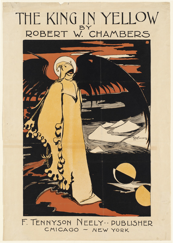
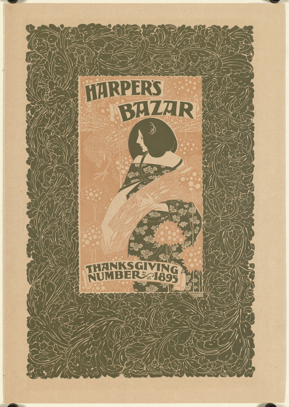
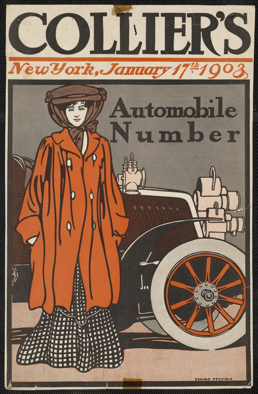
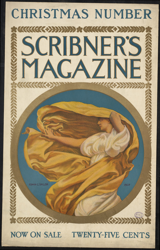
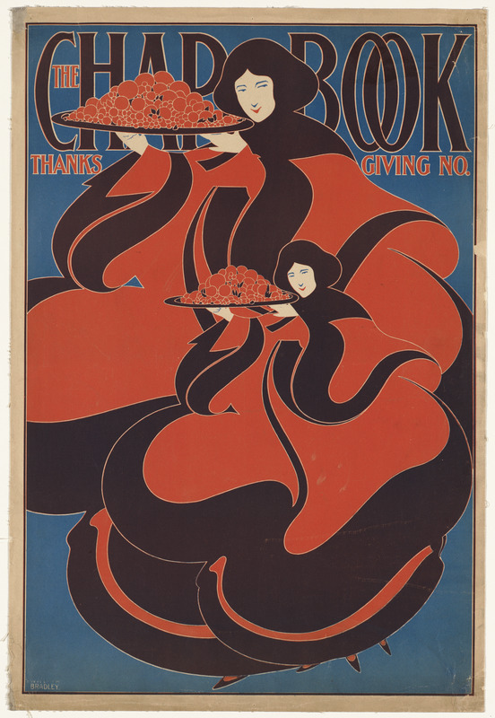
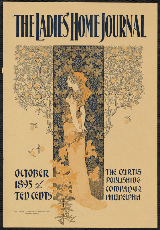
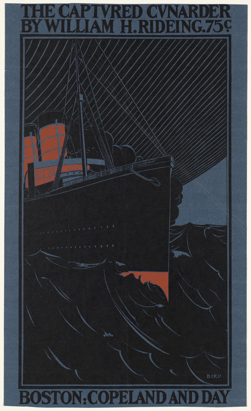
From the archives of the Boston Public Library’s Louis Prang & Company Chromolithographs collection, all scanned in lovingly, Rodney’s-friendly high resolution. L. Prang & Co.’s cards and prints were popular in the late 19th and early 20th Century; Prang is credited with popularizing the Christmas card in America. The total digitized collection contains over 1400 images.
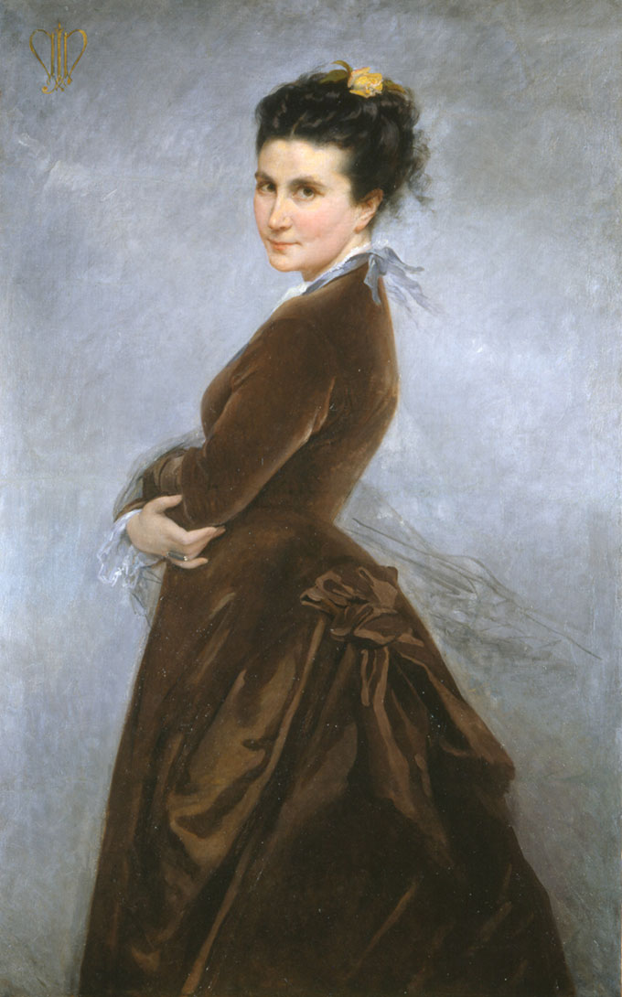
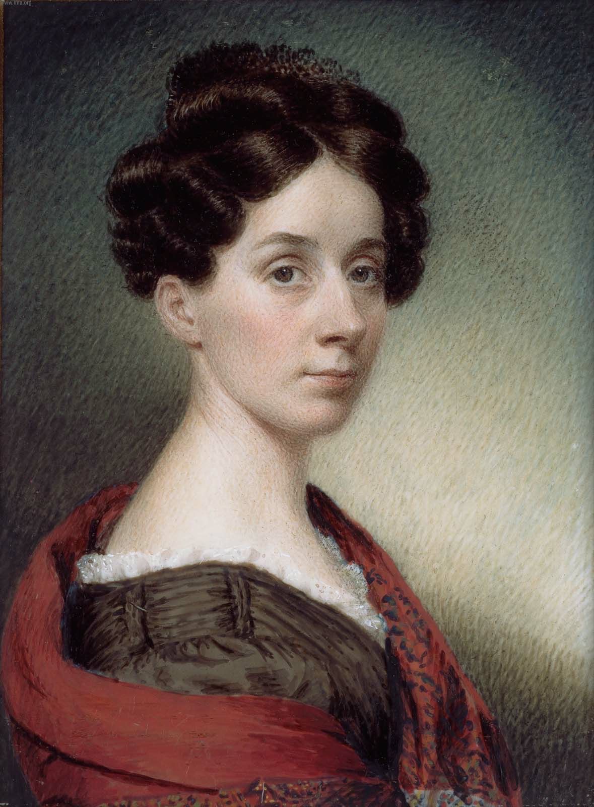
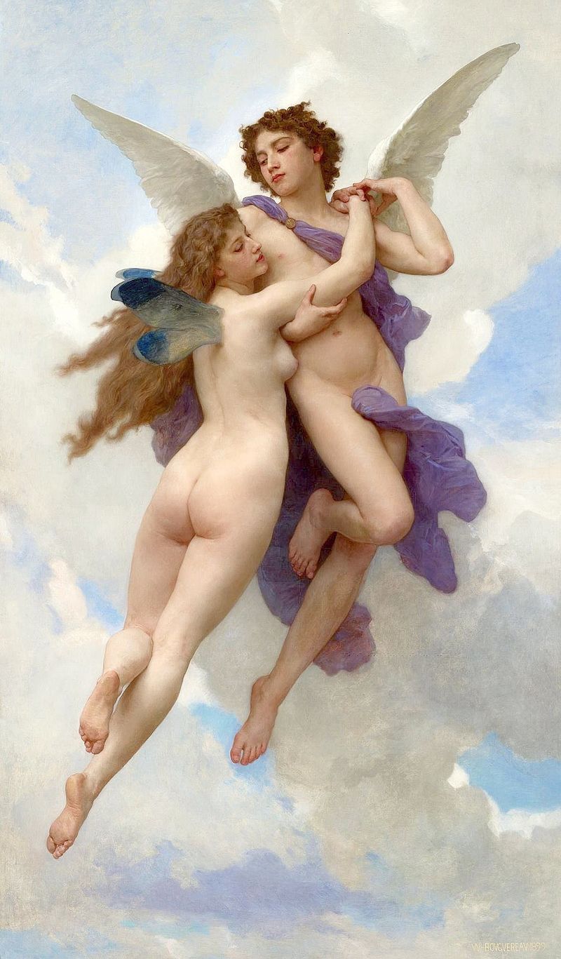
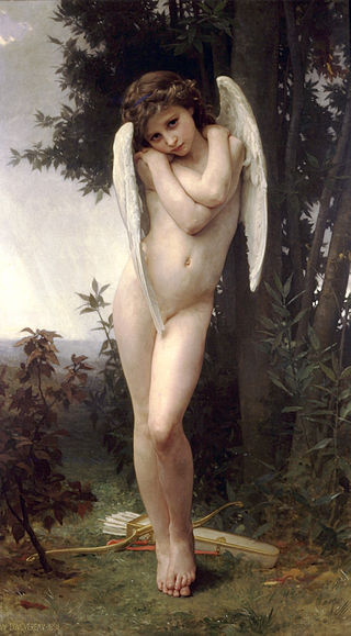
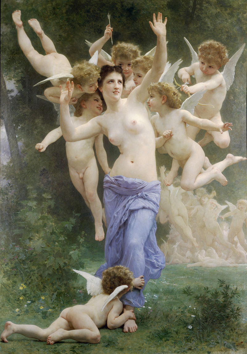
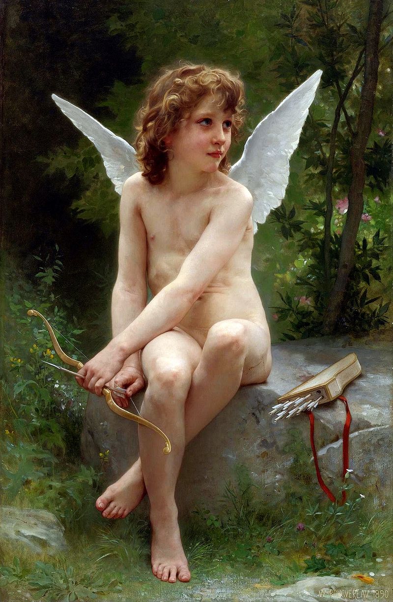
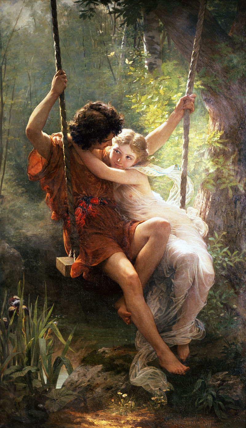
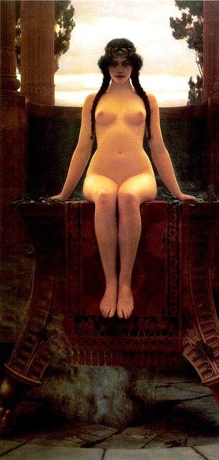
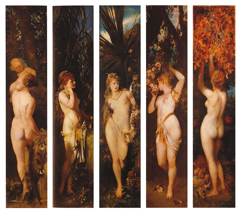
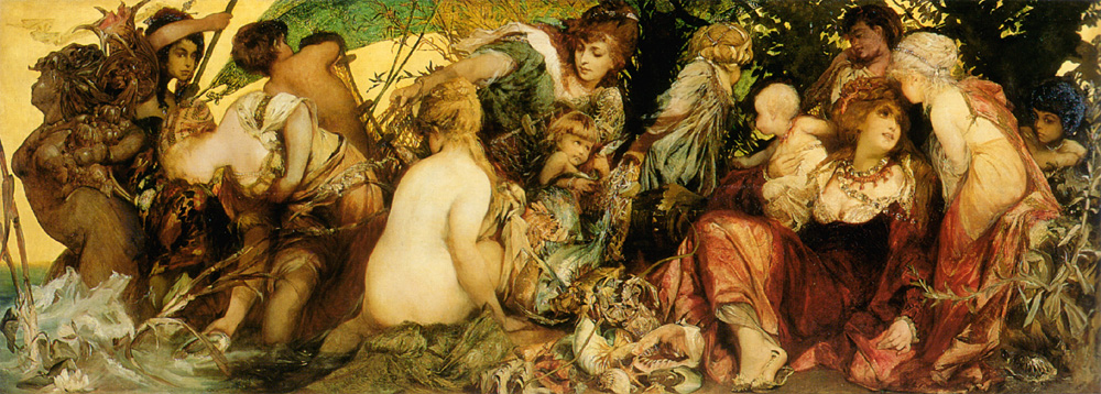
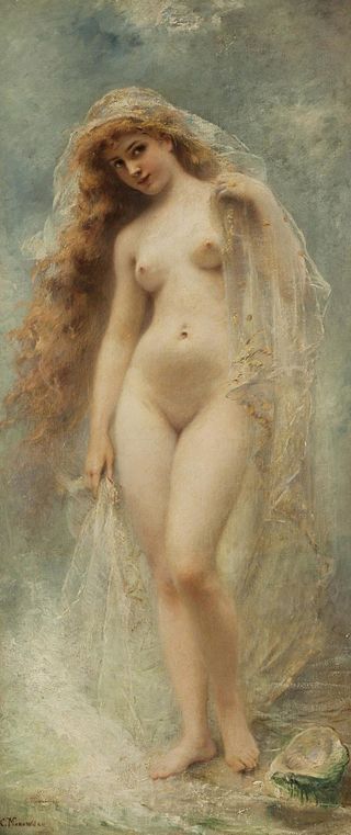
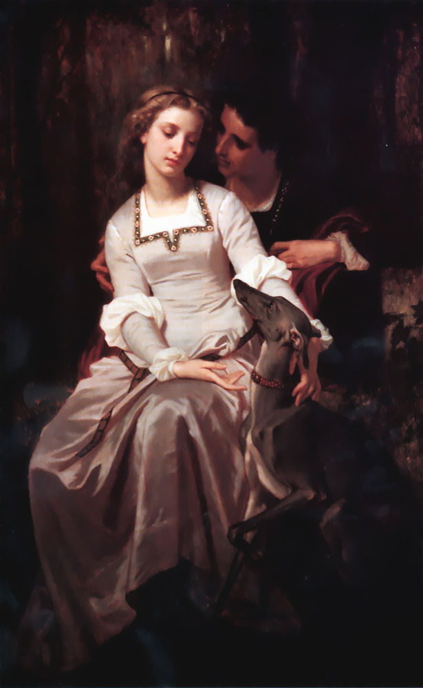
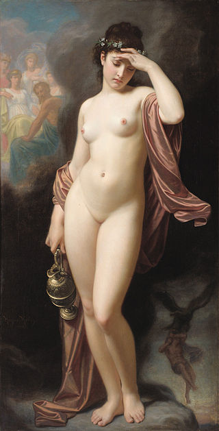
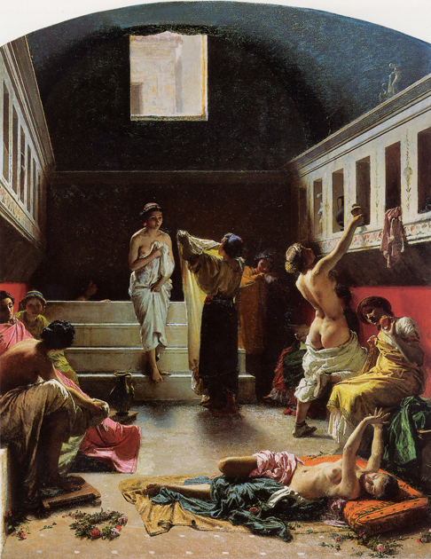
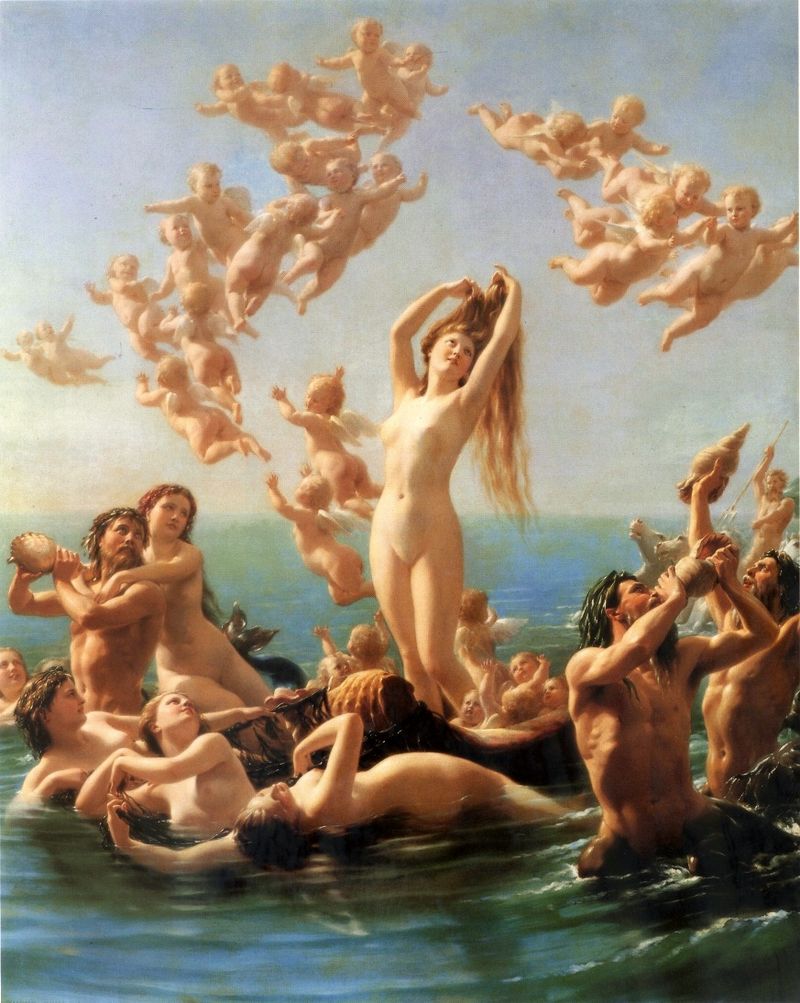
Strip the striving out of Romanticism, the fear out of Symbolism, and this is what you get. Endless Joans of Arc, Opheliae, Venuses. Putti, cupids and angels. Nudes. Sentimentalism.
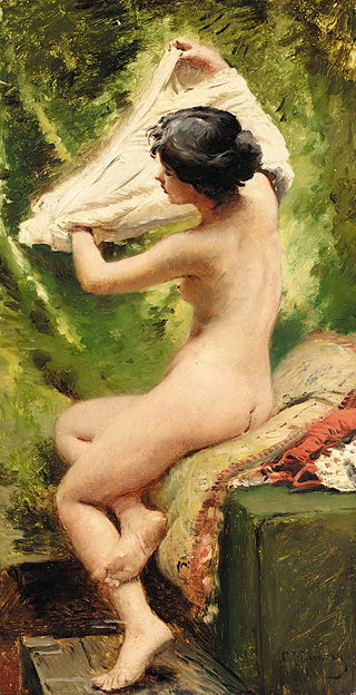
Note the awkward, static poses of Academic art. Any pretext for nudity. There’s a reason this movement fell out of favor. (But are Schiele‘s sneering portraits of his own corrupted harem any more pure as art for having their beauty removed?)
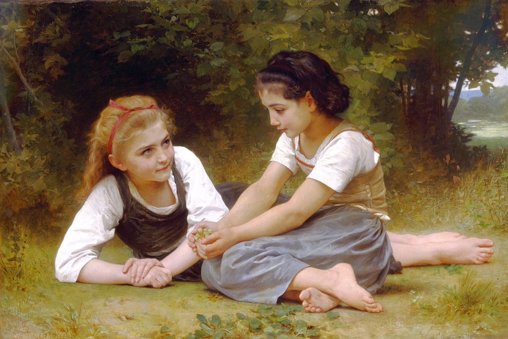
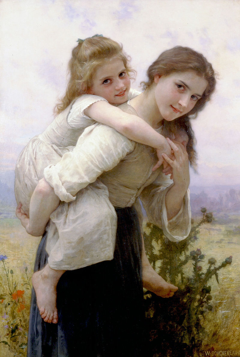
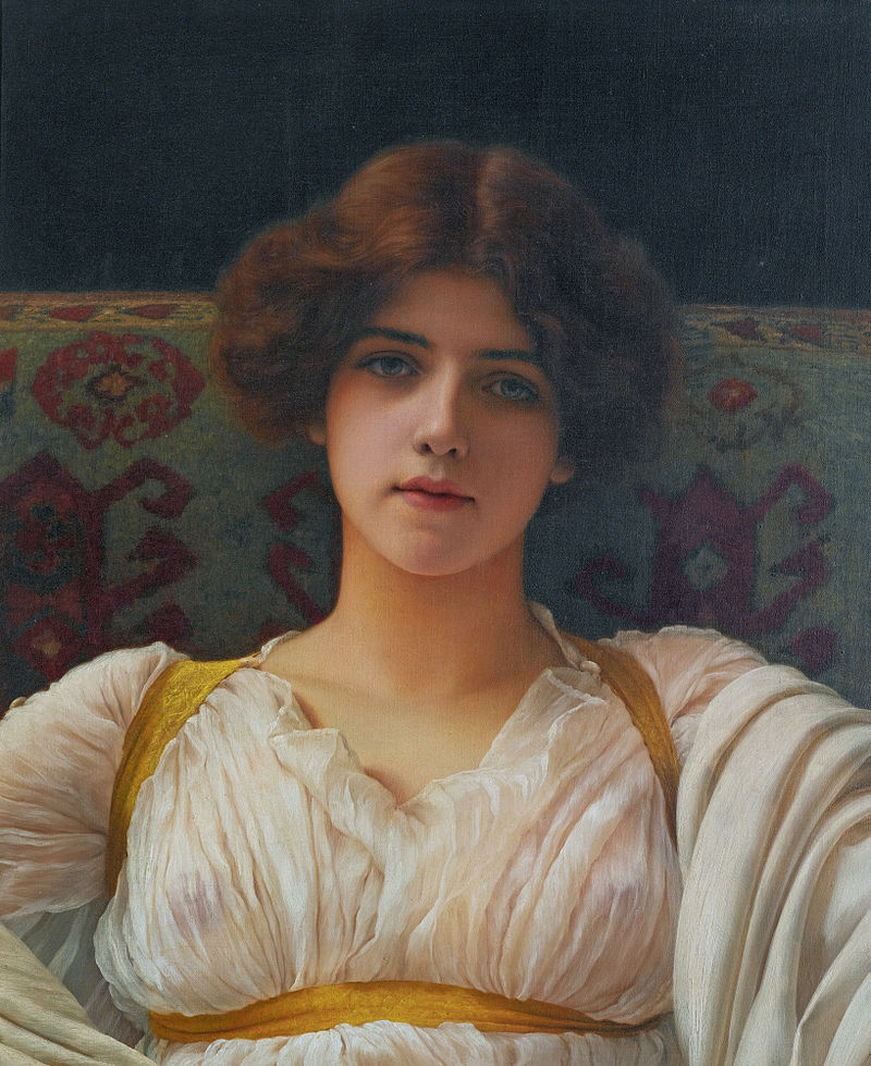
Note Bouguereau’s almost paternal use of the same models sometimes for decades: the same faces appearing on children, youths, mothers, lending his work a hint of something deeper than critic-pleasing cheesecake.
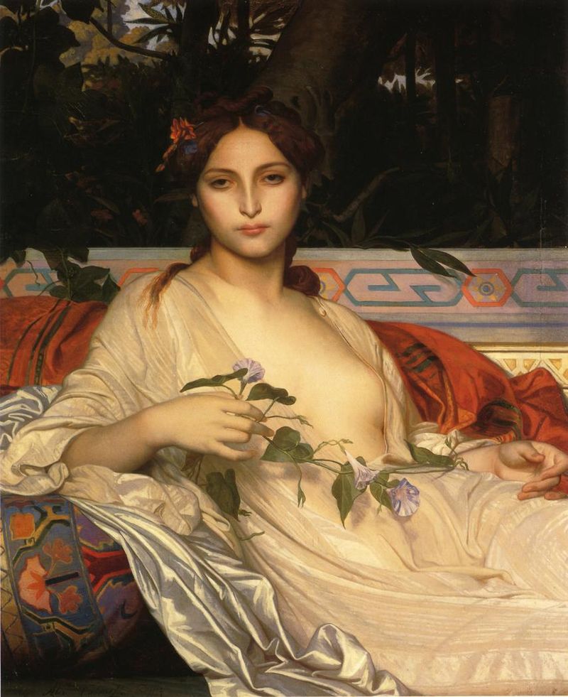
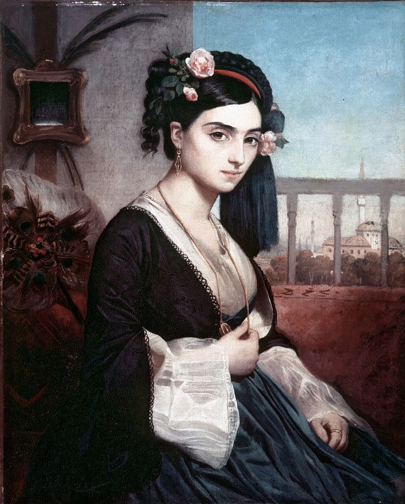
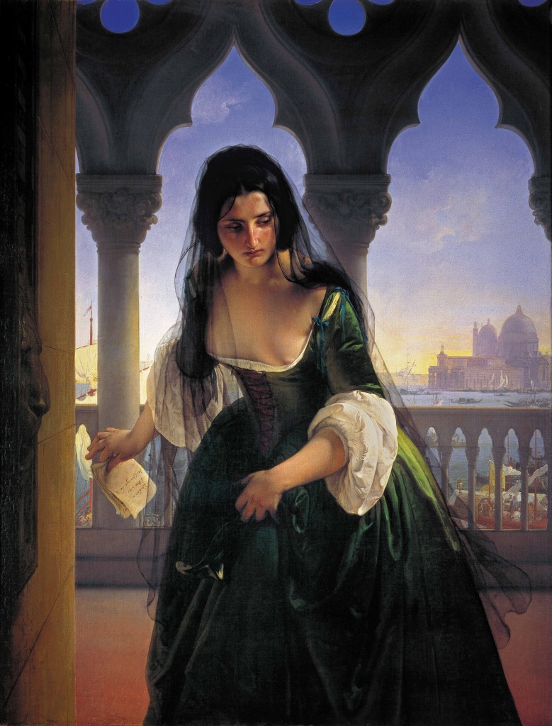
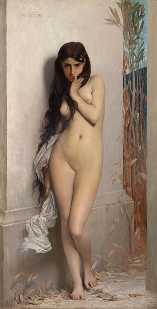
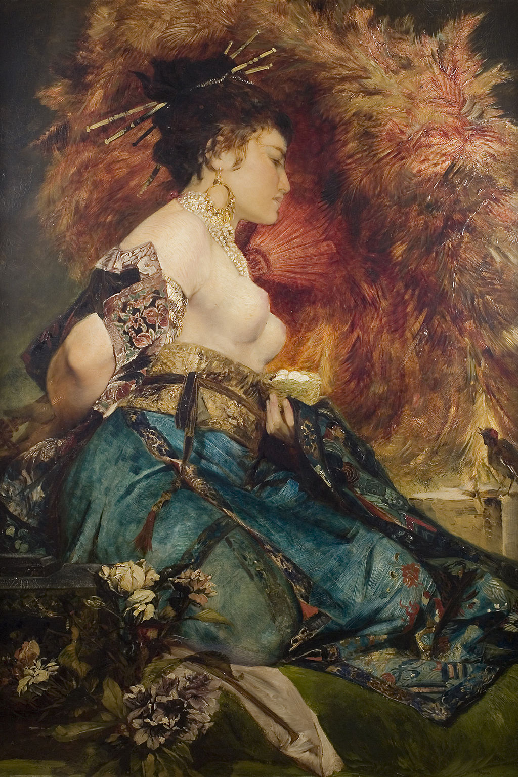
How hard do you come down on Orientalism? No matter how bubbled the glass, it remains a looking outward, a fascination with Otherness. Darkly will be glimpsed our dreams–sweet, cruel, lascivious, and all three–but we look only to be looked back upon. Gleyre’s Persian girl still fixes us in the gaze of an undeniable humanity.
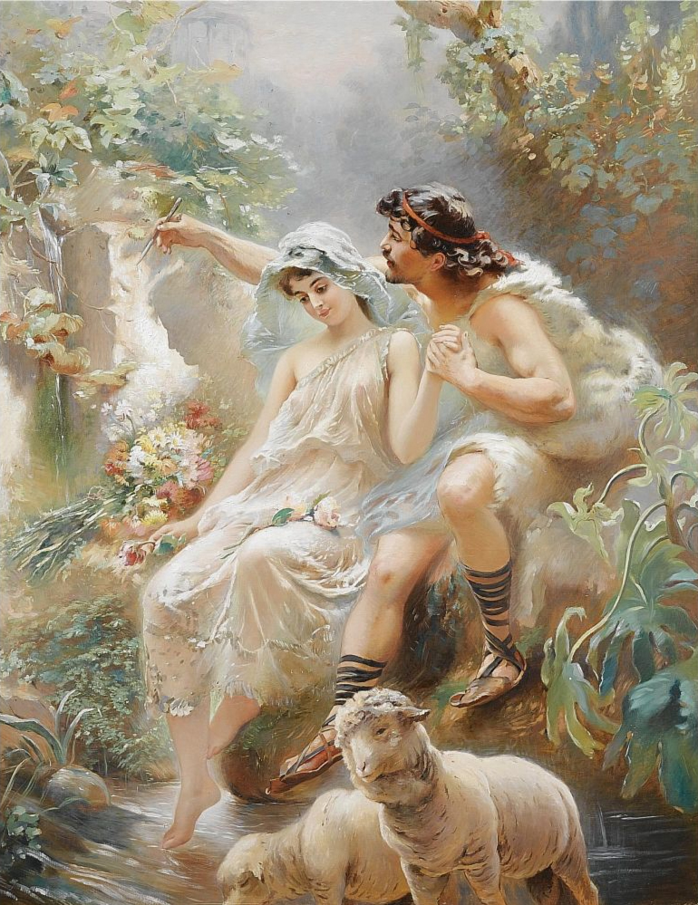
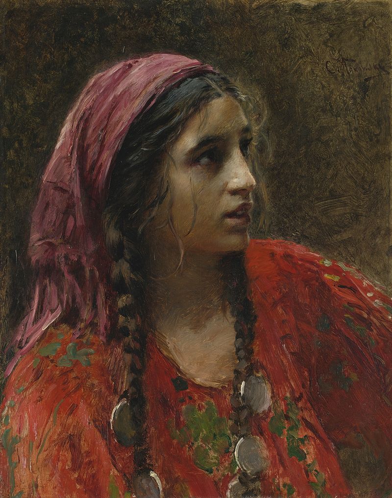
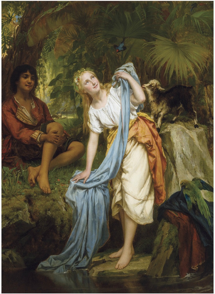
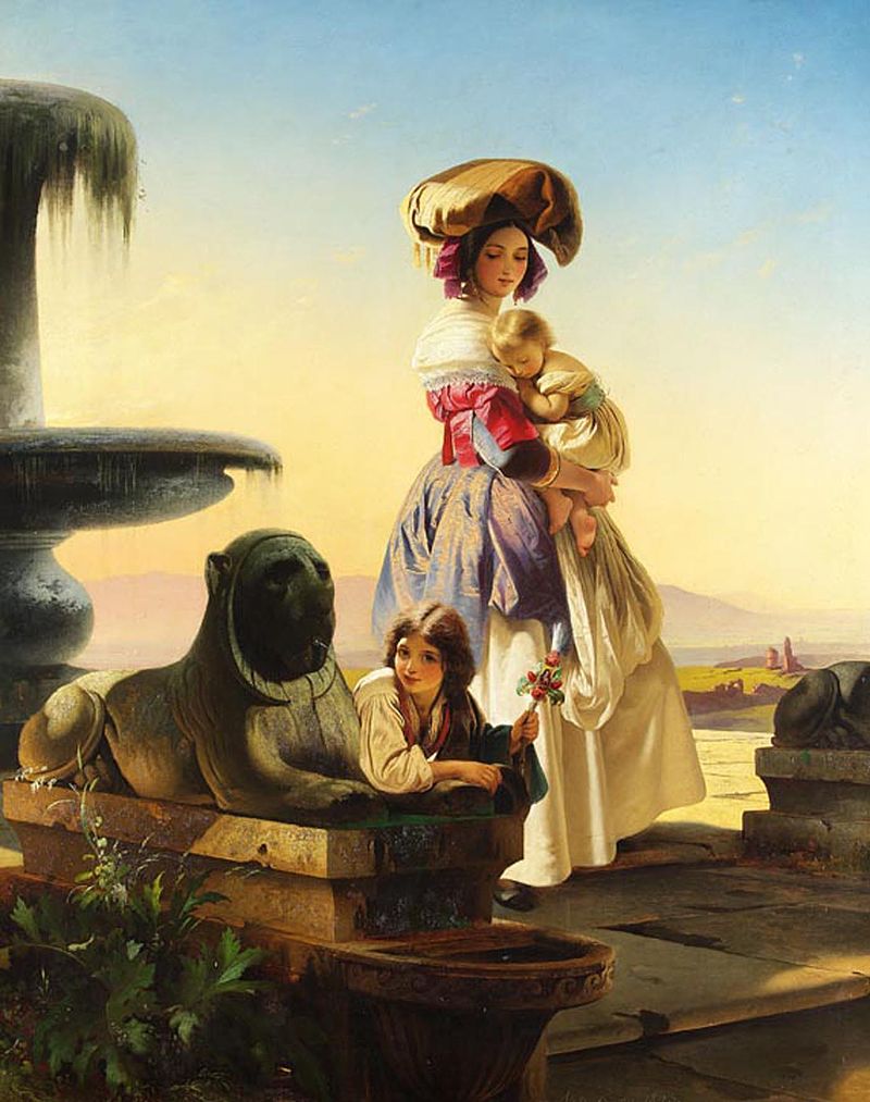
Is there an opposite to Orientalism? Peasant fascination in Academic Art tends to represent only the dream of Arcadia, not any deeper social conscience. (But then there’s Makovsky’s gypsy.)
You know Arcadia. It’s there behind the bluetooth headphones Starbucks paperboard the stab of parking car headlights 69 megapascals of compressive force darkened glass bad music discount raincoat soap as an offensive perfume and cologne as an offensive weapon some girl life moving around you where are you going why have you been that person you should text her you should text her blue asshole lights in the rain darkness glistening like surgical instruments and the dream of Arcadia.
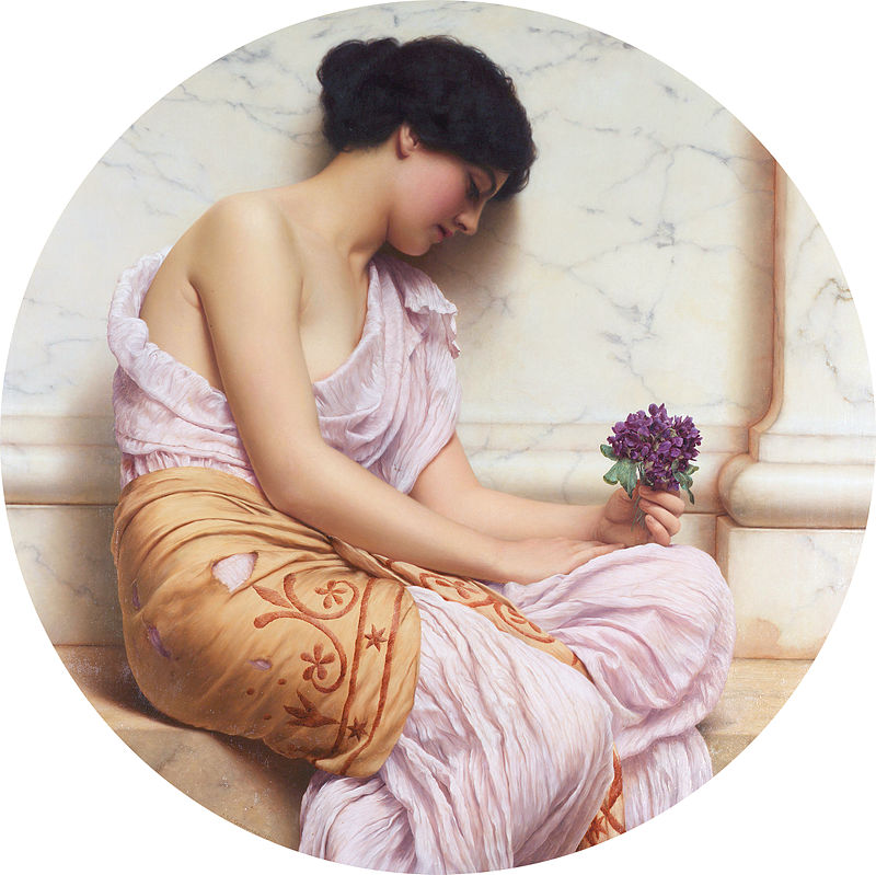
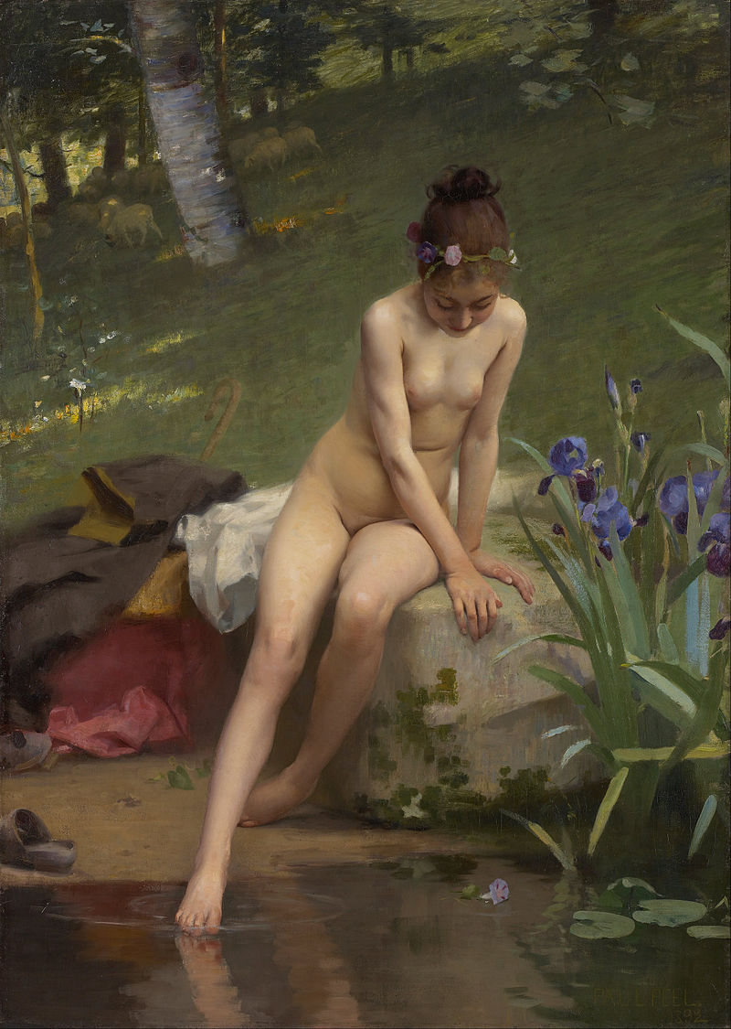
Imagine Peel’s juvenile shepherdess as a photograph leaked onto the internet. Is it any wonder that the soft simplicity of the dream still speaks to us?
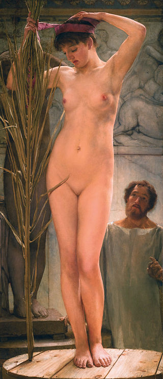
Lawrence Alma-Tadema “A Sculptor’s Model”
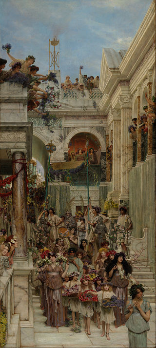
Lawrence Alma-Tadema “Spring”
Pedro Américo “Joan of Arc”
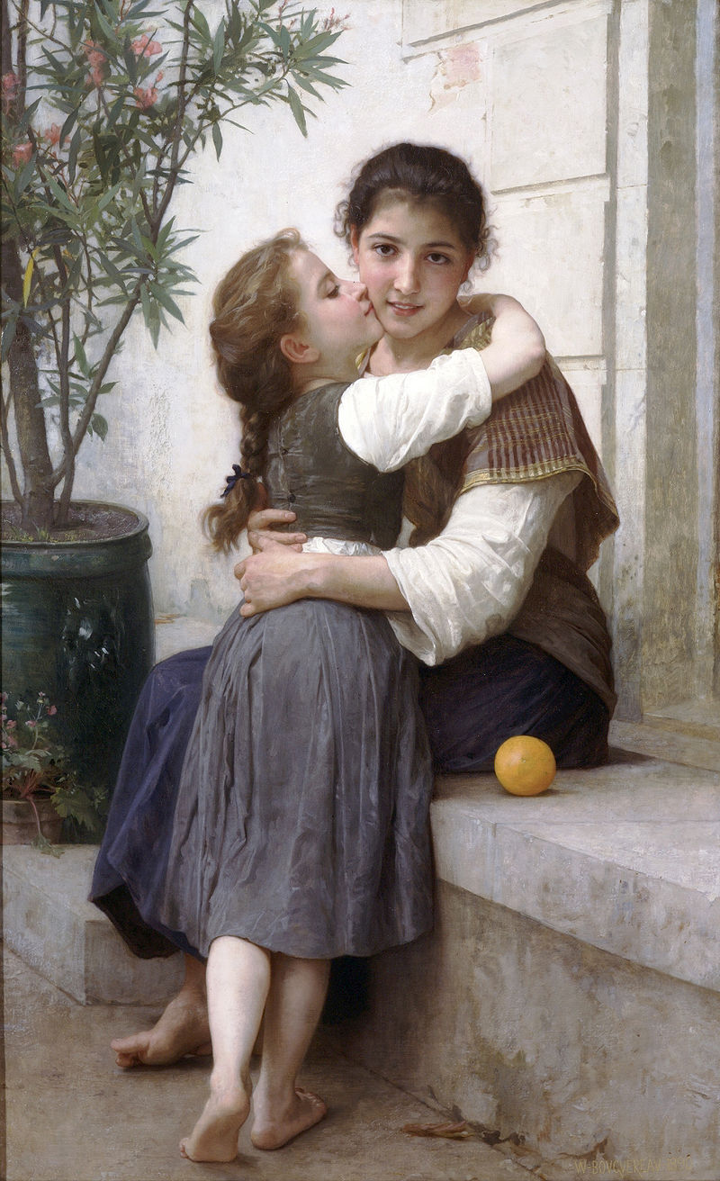
William-Adolphe Bouguereau “A Little Coaxing” (1890)
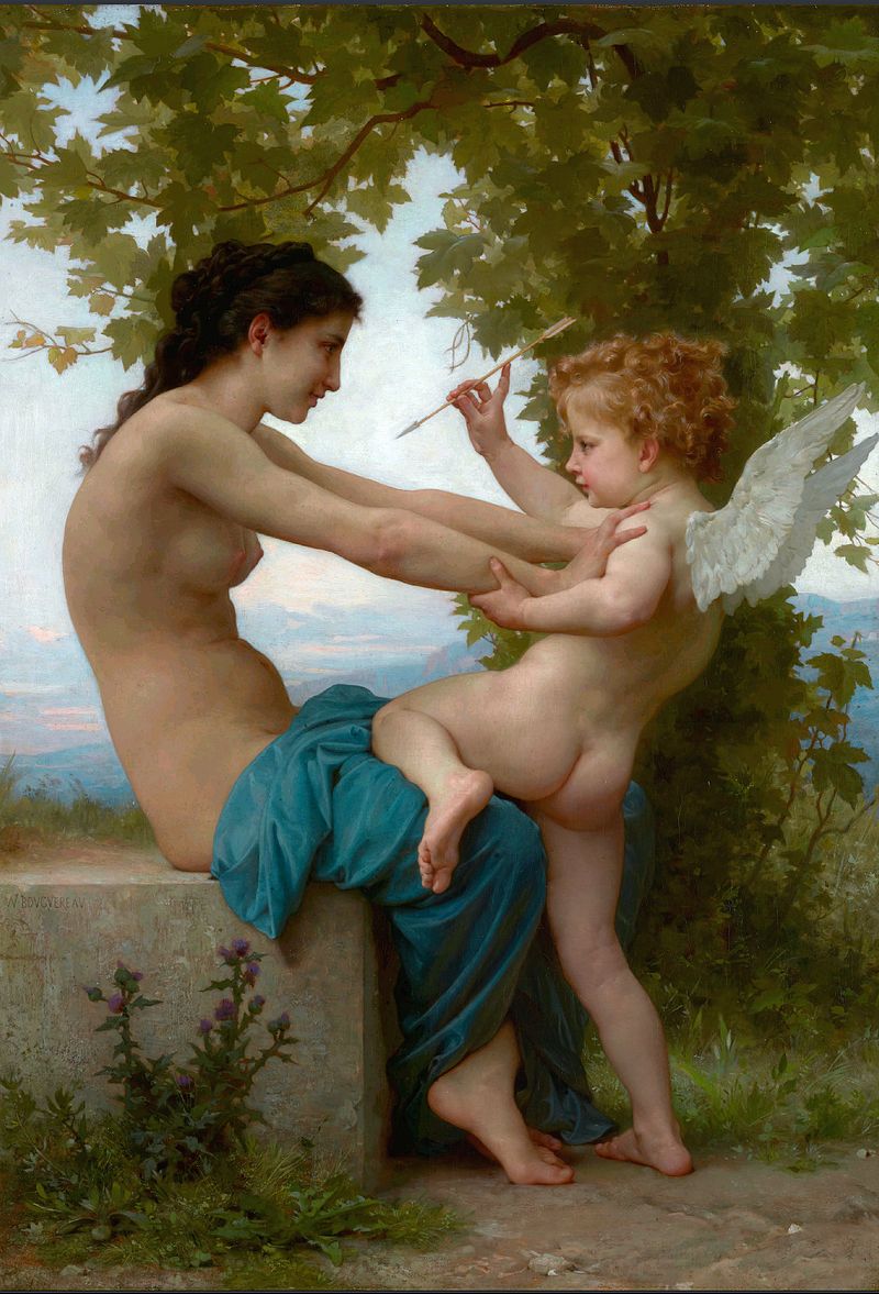
William-Adolphe Bouguereau “A Young Girl Defending Herself Against Eros” (1880)
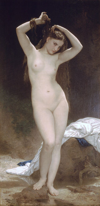
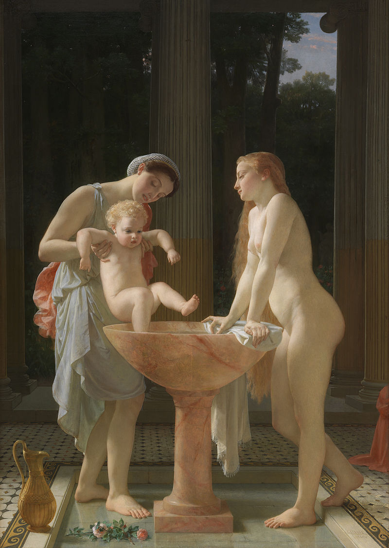
William-Adolphe Bouguereau “After the Bath” (1875)
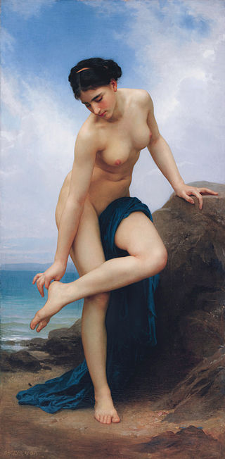
William-Adolphe Bouguereau “Bather” (1870)
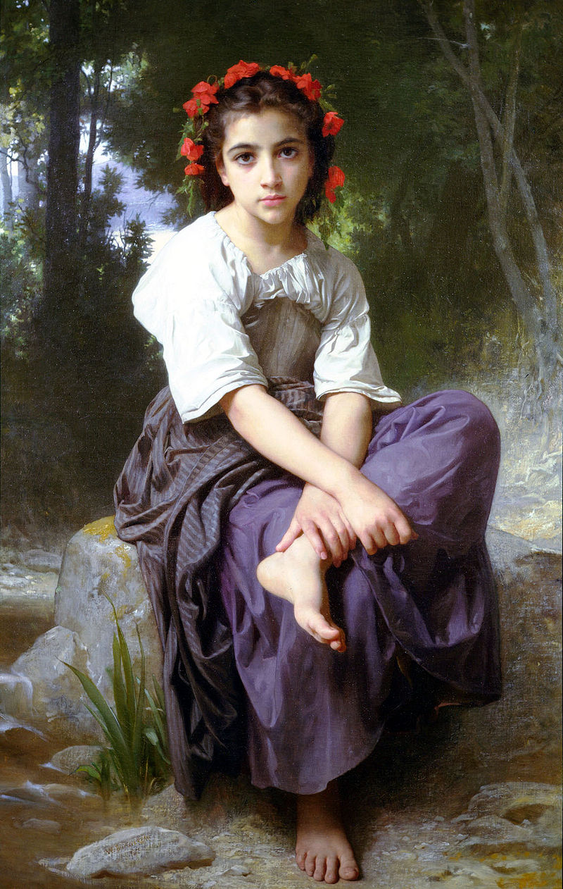
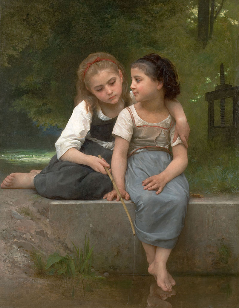
William-Adolphe Bouguereau “At the Edge of the Brook” (1875)
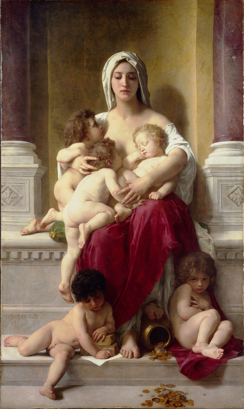
William-Adolphe Bouguereau “Charity” (1878)
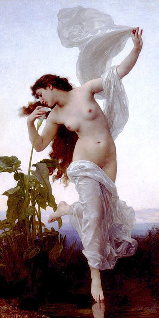
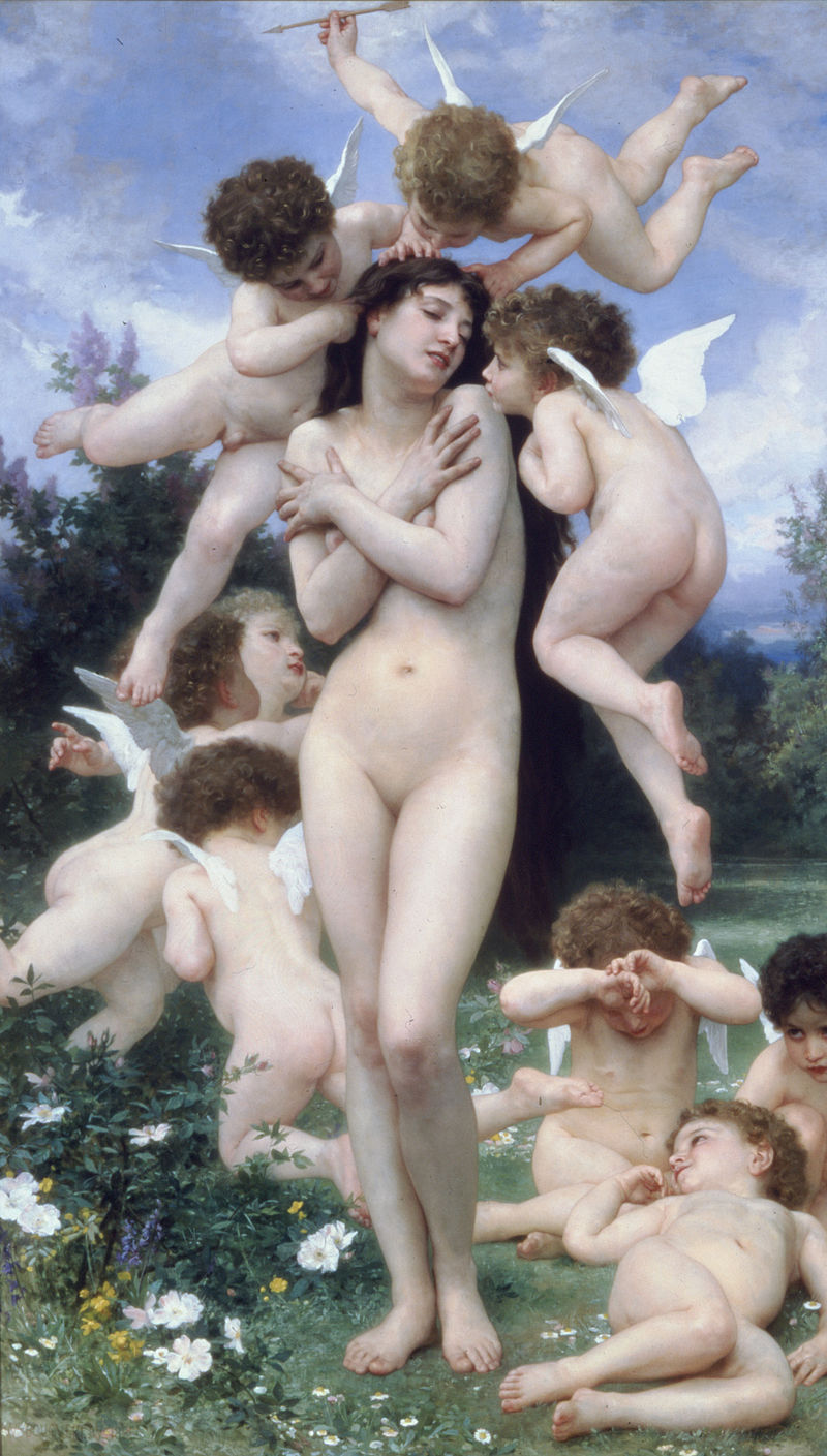
William-Adolphe Bouguereau “Dawn” (1881)
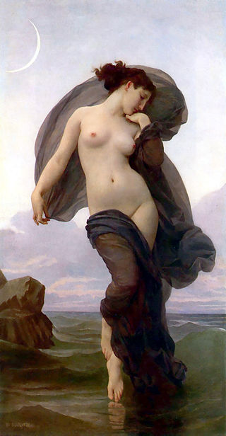
William-Adolphe Bouguereau “Evening Mood” (1882)
William-Adolphe Bouguereau “L’Amour et Psych” (1899)
William-Adolphe Bouguereau “L’Amour Mouille”
William-Adolphe Bouguereau “L’Orage” (1874)
William-Adolphe Bouguereau “Le Guêpier” (1892)
William-Adolphe Bouguereau “Les noisettes”
William-Adolphe Bouguereau “Les Oreades” (1902)
William-Adolphe Bouguereau “Love on the Lookout” (1890)
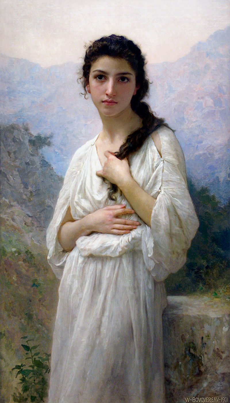
William-Adolphe Bouguereau “Meditation” (1901)
William-Adolphe Bouguereau “Not Too Much To Carry” (1895)
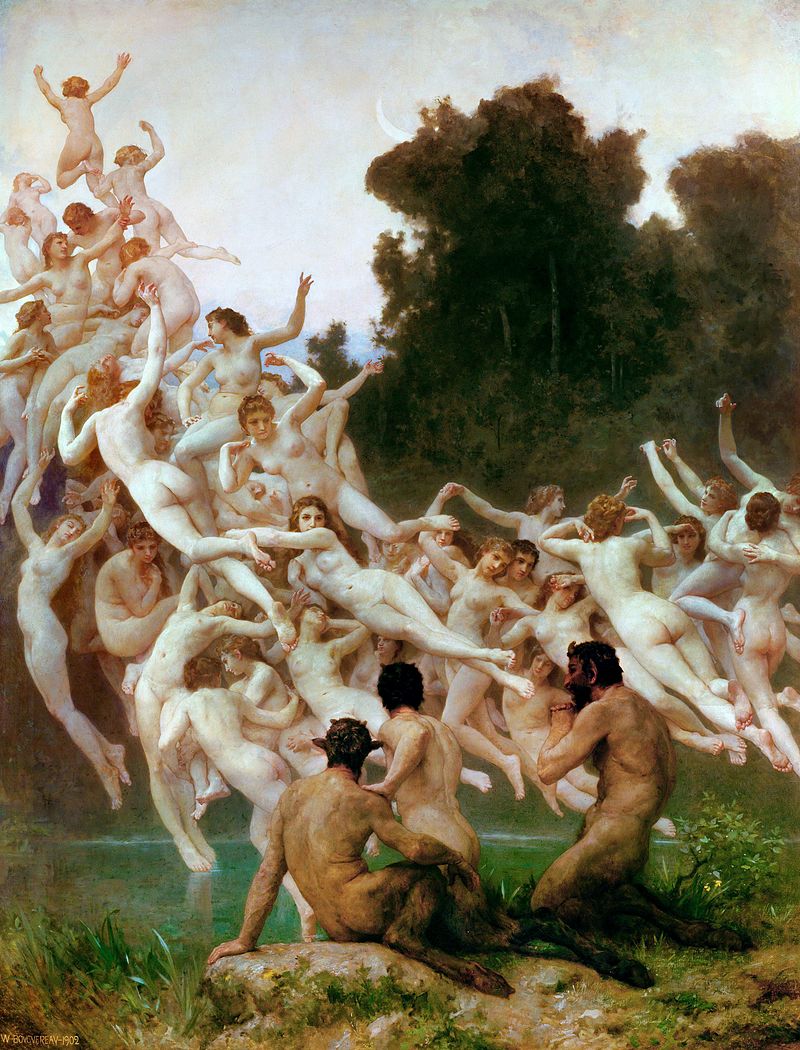
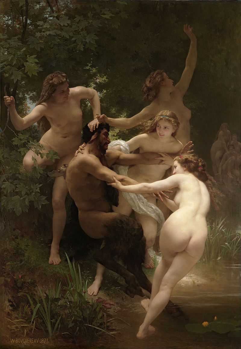
William-Adolphe Bouguereau “Nymphs and Satyr” (1873)
William-Adolphe Bouguereau “Pêche pour les grenouilles”
William-Adolphe Bouguereau “Return of Spring” (1886)
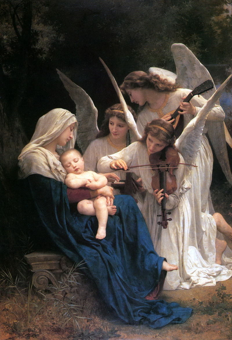
William-Adolphe Bouguereau “Song of the Angels” (1881)
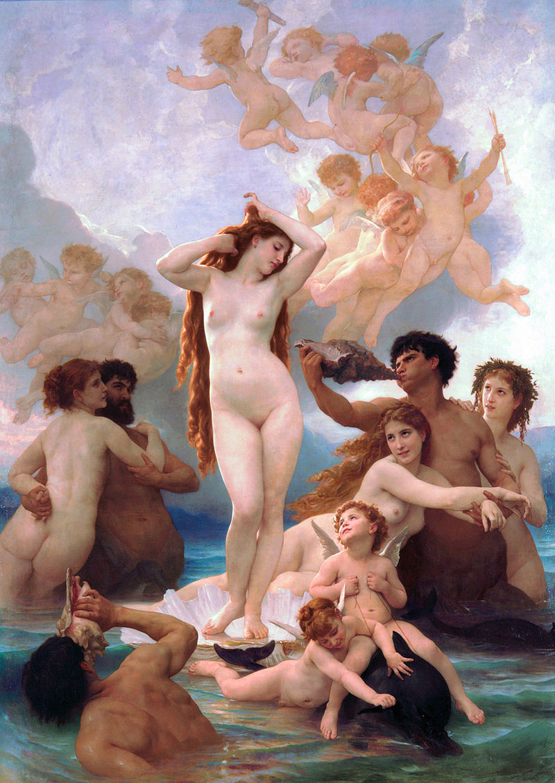
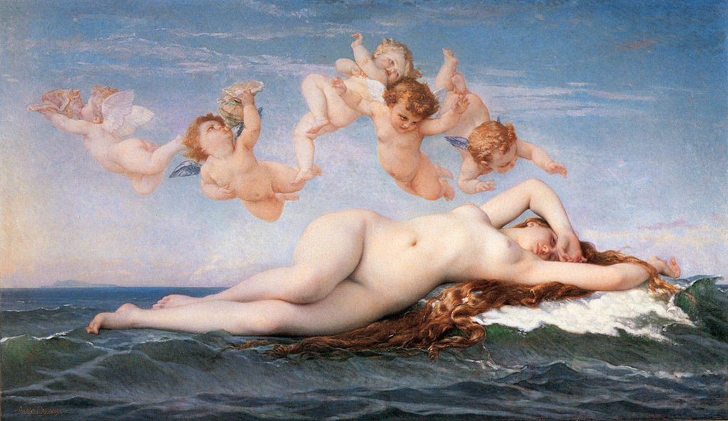
William-Adolphe Bouguereau “The Birth of Venus” (1879)
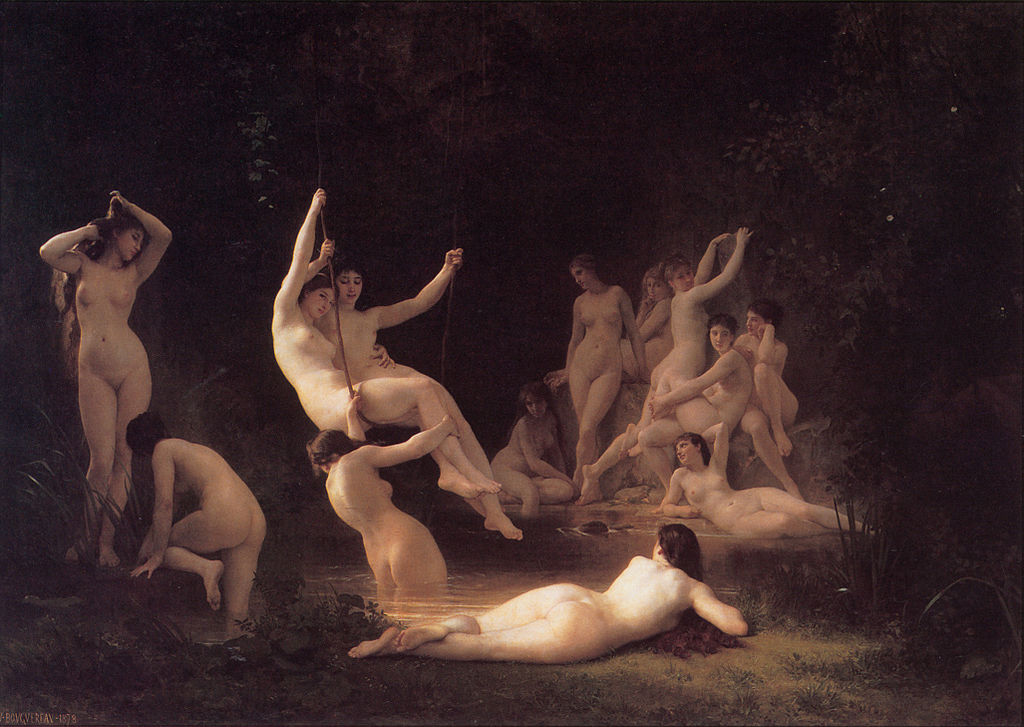
William-Adolphe Bouguereau “The Nymphaeum” (1878)
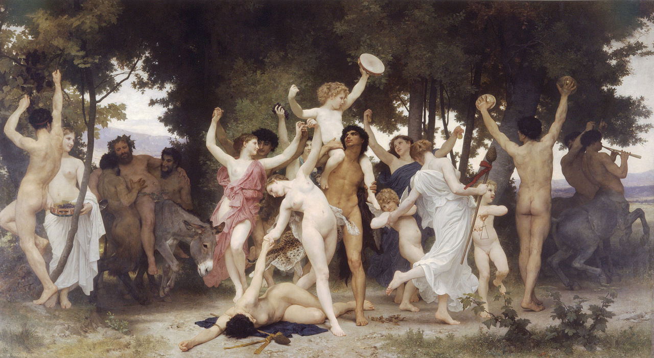
William-Adolphe Bouguereau “The Youth of Bacchus” (1884)
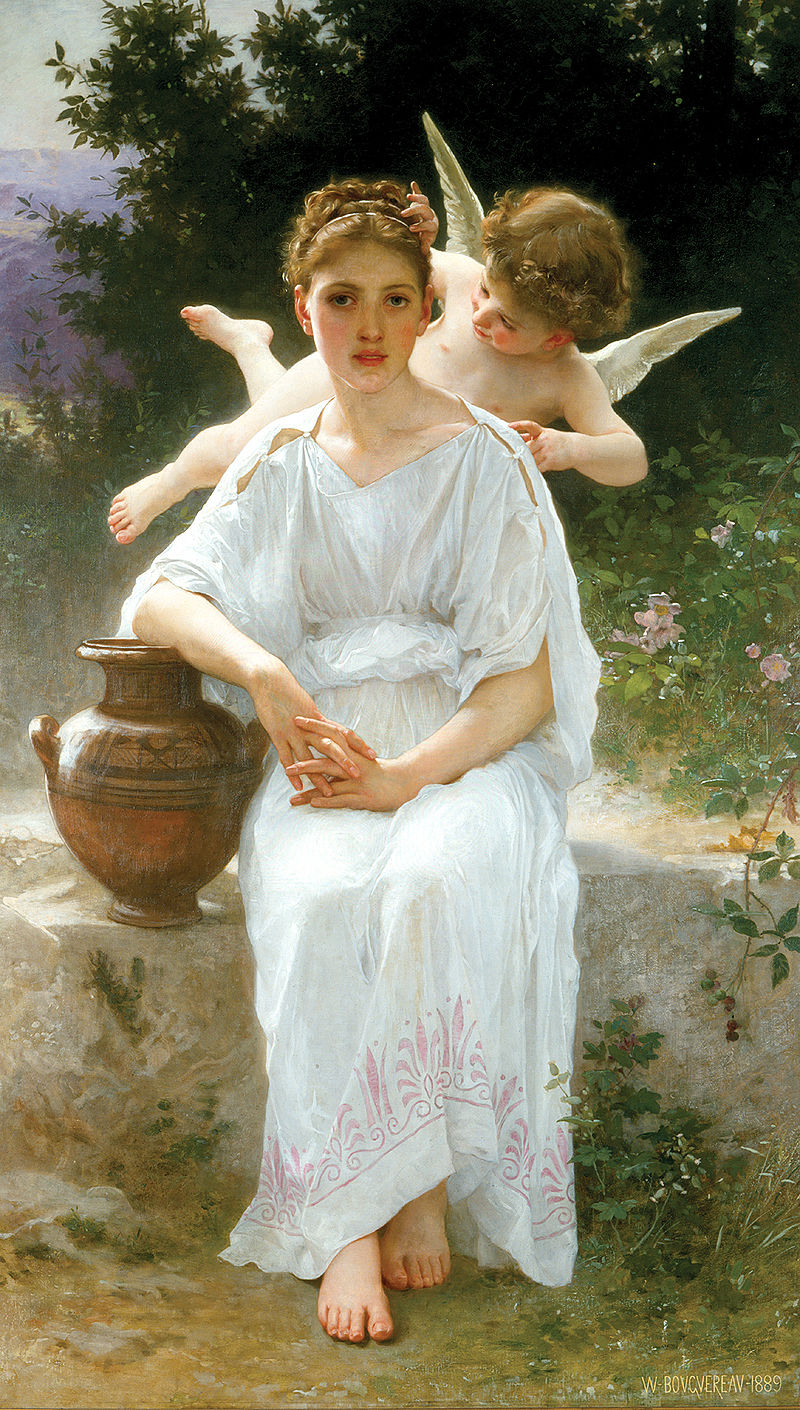
William-Adolphe Bouguereau “Whisperings of Love” (1889)
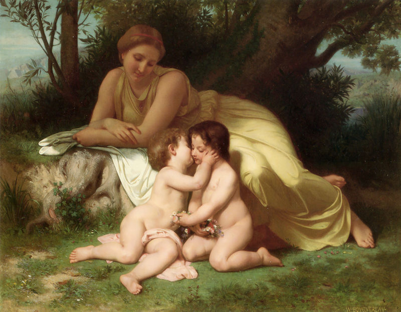
William-Adolphe Bouguereau “Young Woman Contemplating Two Embracing Children” (1861)
Alexandre Cabanel “Albayde”
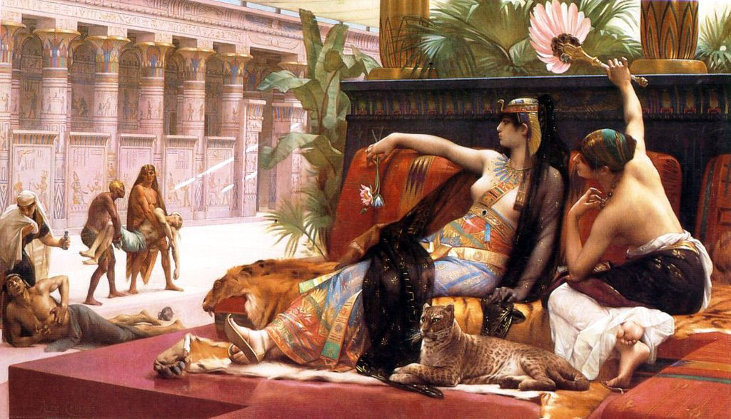
Alexandre Cabanel “Cléopatre essayant des poisons sur des condamnés à mort”
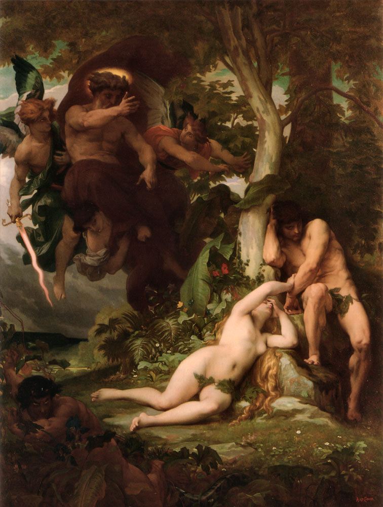
Alexandre Cabanel “Expulsion of Adam and Eve”
Alexandre Cabanel “The Birth of Venus” (1863)
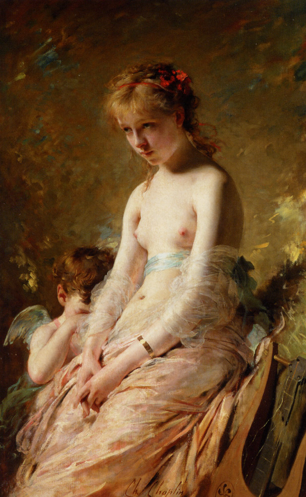
Charles Chaplin “A Song Silenced”
Pierre Auguste Cot “Ophelia”
Pierre Auguste Cot “Spring” (1873)
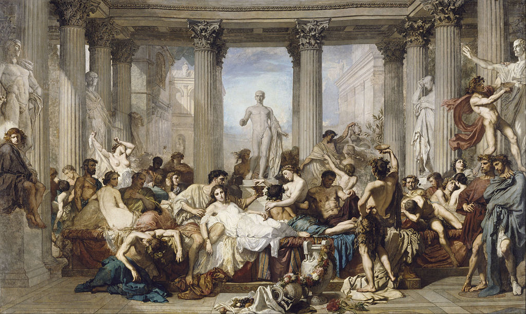
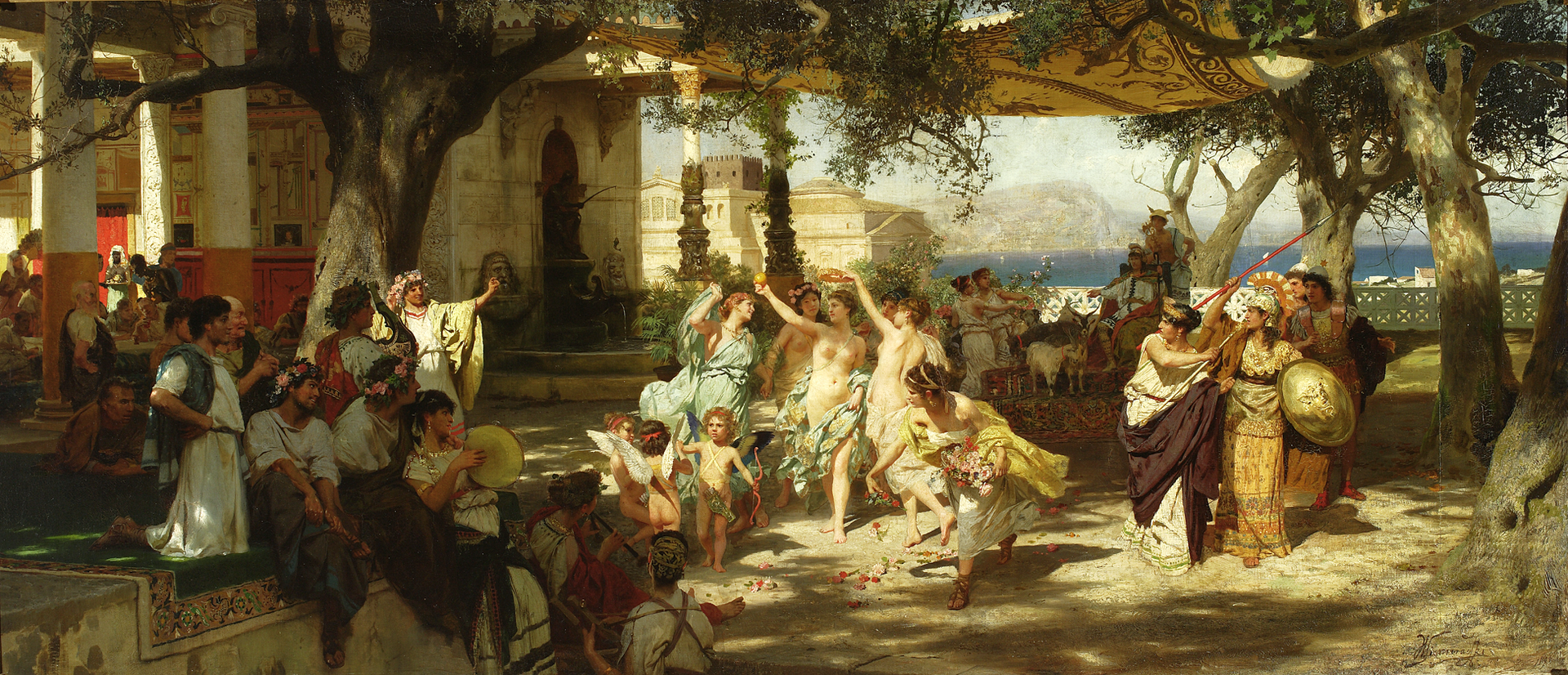
Thomas Couture “Romans During the Decadence”
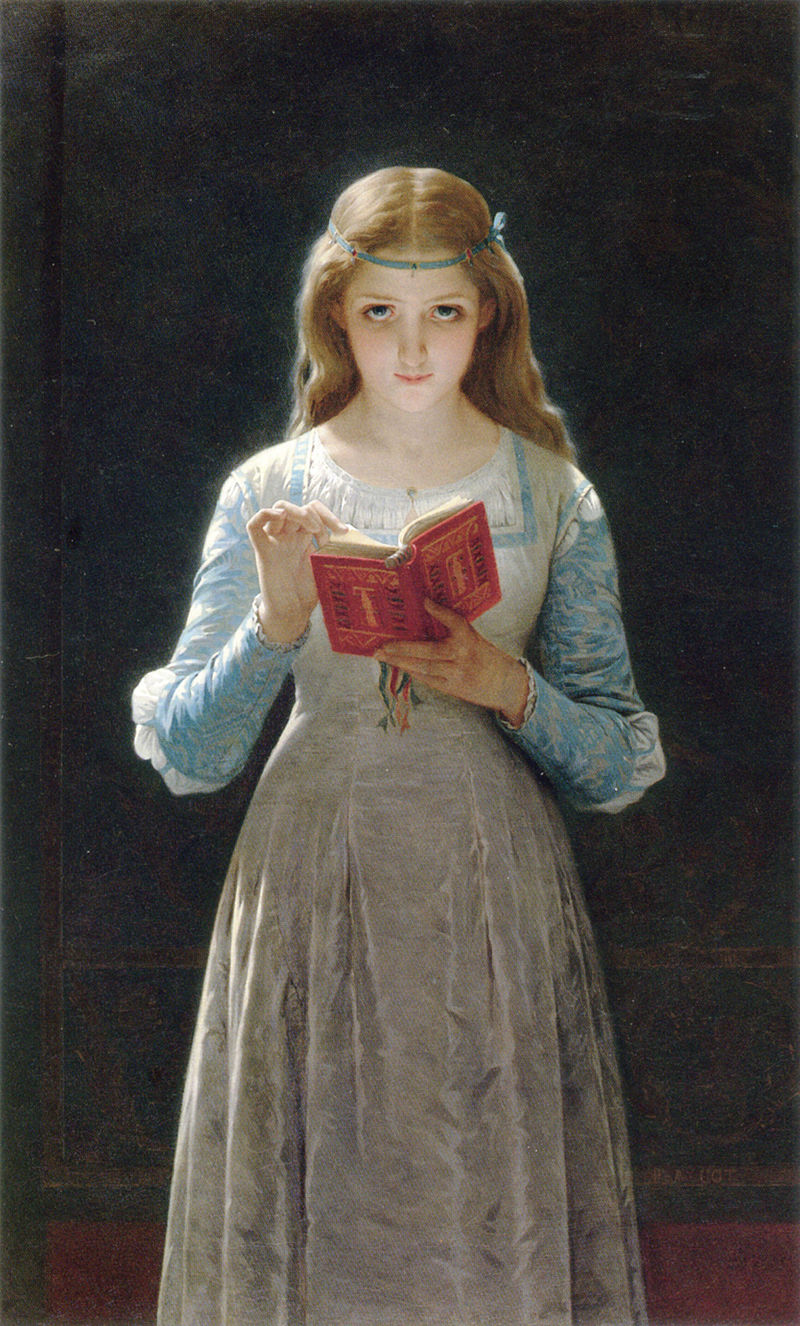
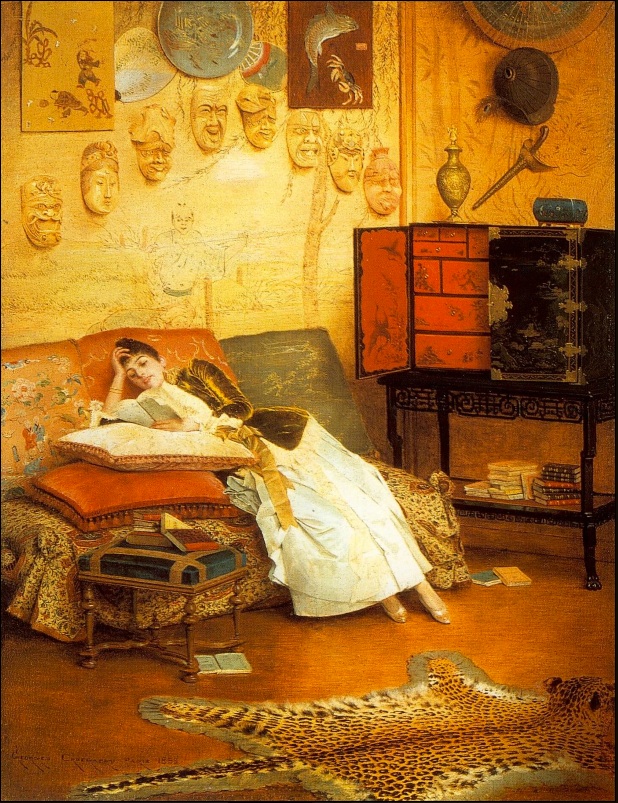
Georges Croegaert “The Reading Woman”
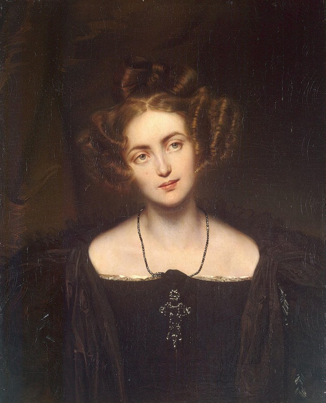
Paul Delaroche “Henriette Sontag in her Donna Anna Costume” (1831)
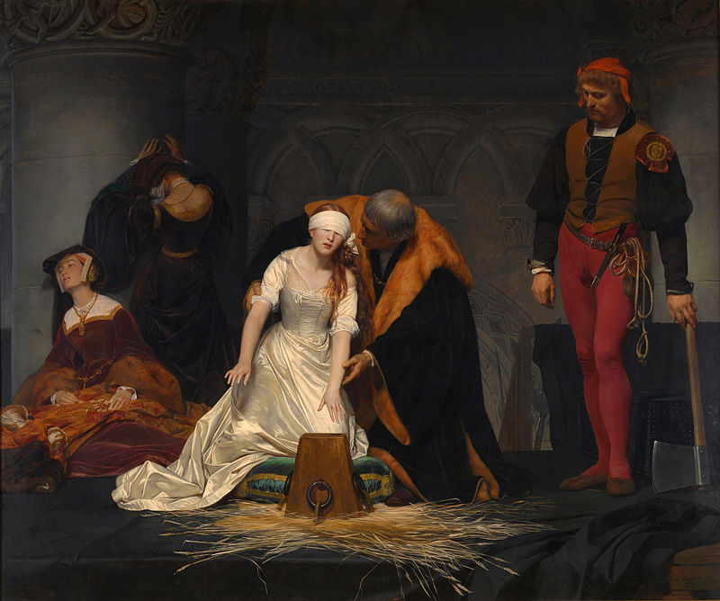
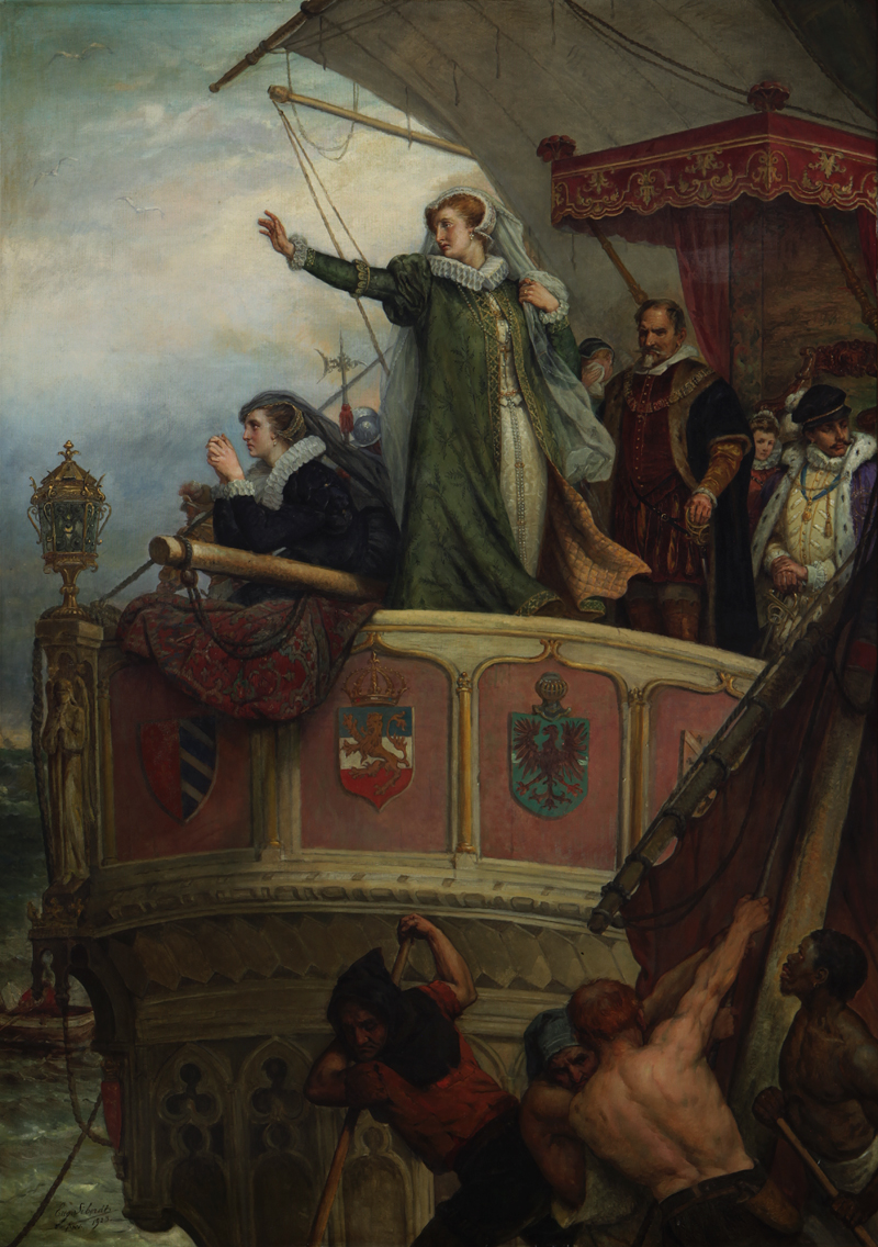
Paul Delaroche “Execution of Lady Jane Grey” (1834)
Anselm Feuerbach “Medea”
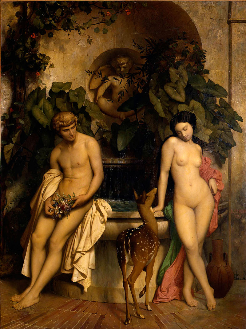
Jean-Léon Gérôme “An Idyll” (1852)
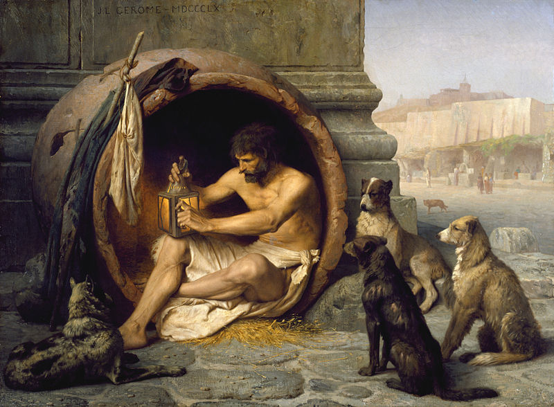
Jean-Léon Gérôme “Diogenes”
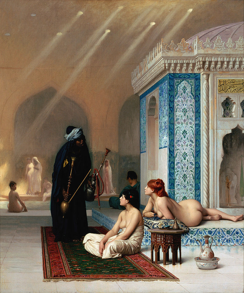
Jean-Léon Gérôme “Harem Pool”
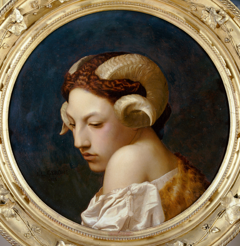
Jean-Léon Gérôme “Head of a Woman”
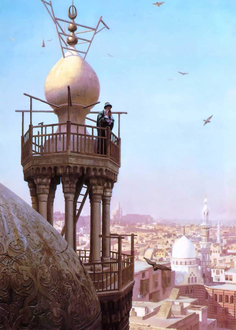
Jean-Léon Gérôme “Muezzin Calling from the Top of a Minaret”
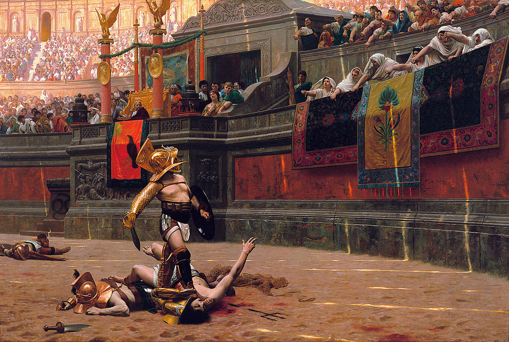
Jean-Léon Gérôme “Pollice Verso”
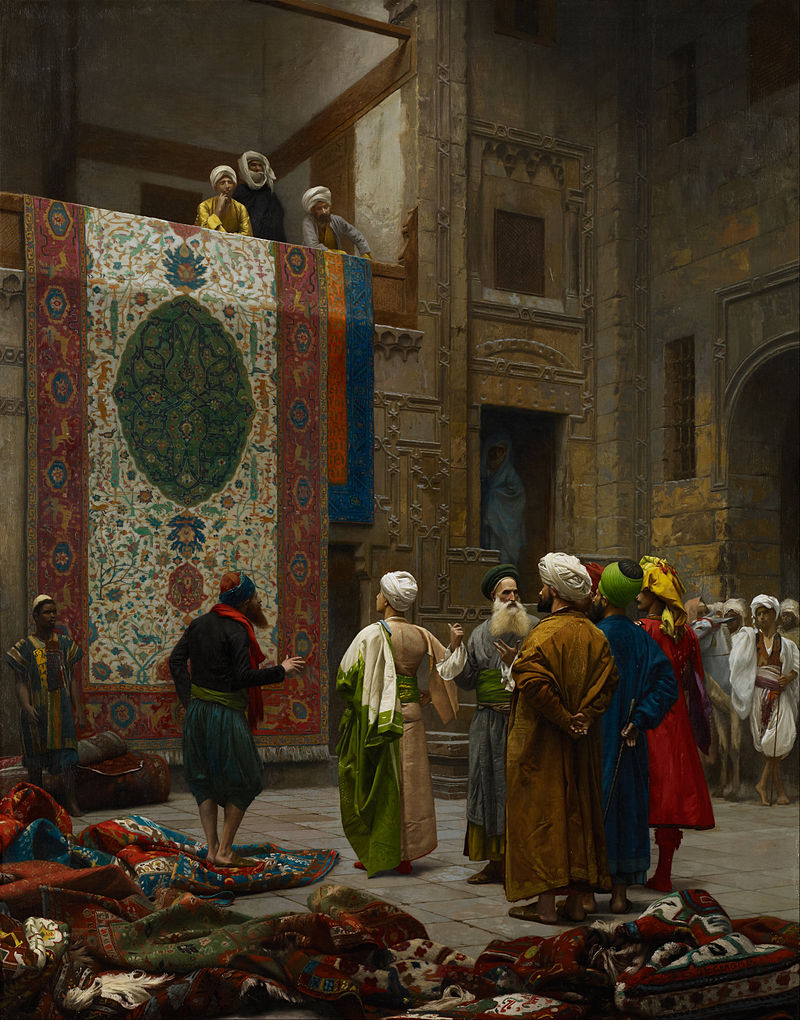
Jean-Léon Gérôme “The Carpet Merchant”
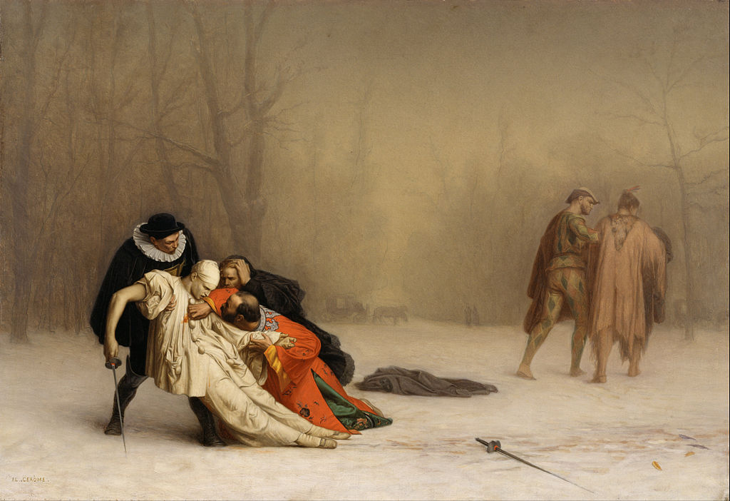
Jean-Léon Gérôme “The Duel After the Masquerade”
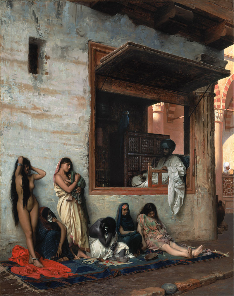
Jean-Léon Gérôme “The Slave Market”
Charles Gleyre “Lost Illusions”
Charles Gleyre “Oriental Lady” (1865)
Charles Gleyre “The Bath”
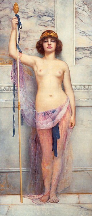
John William Godward “A Priestess” (1893)
John William Godward “Campaspe”
John William Godward “L’Oracle de Delphes” (1899)
John William Godward “Study of Miss Ethel Warwick”
John William Godward “Violets, Sweet Violets”
Francesco Hayez “Accusa segreta” (1847)
Francesco Hayez “Bathsheba Bathing”
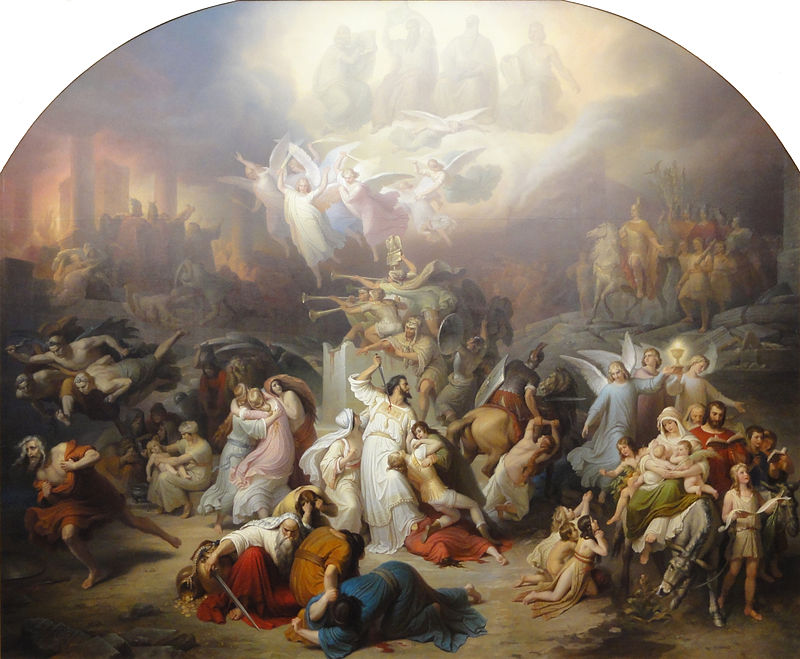
Francesco Hayez “Destruction of the Temple of Jerusalem” (1867)
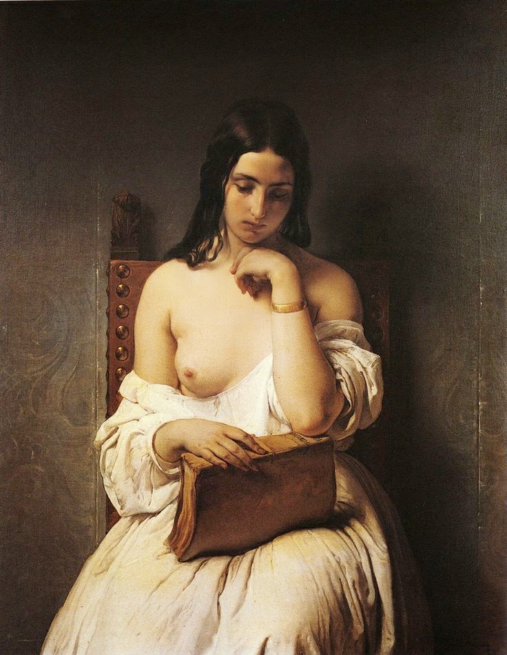
Francesco Hayez “La Meditazione” (1850)
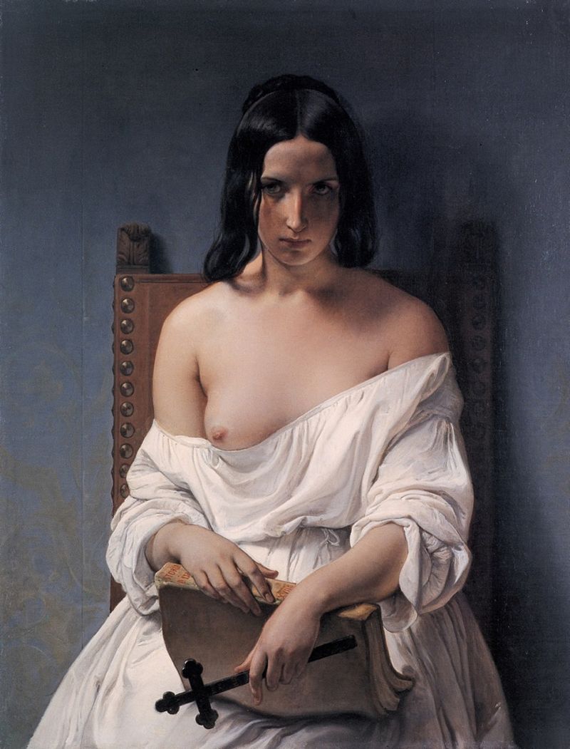
Francesco Hayez “Meditation on the History of Italy”
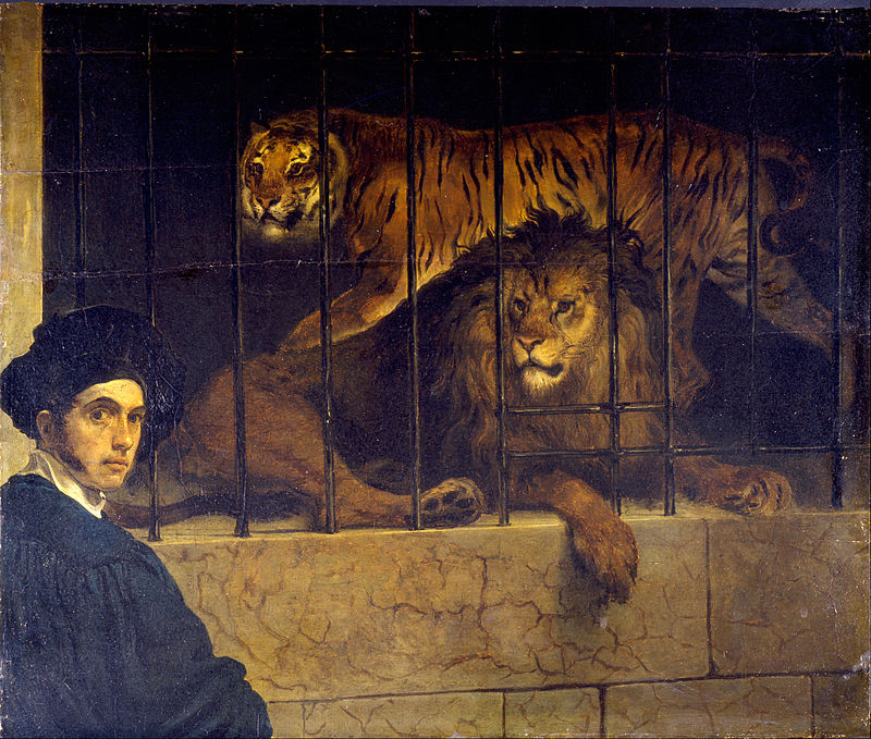
Francesco Hayez “Self-portrait with Tiger and Lion”
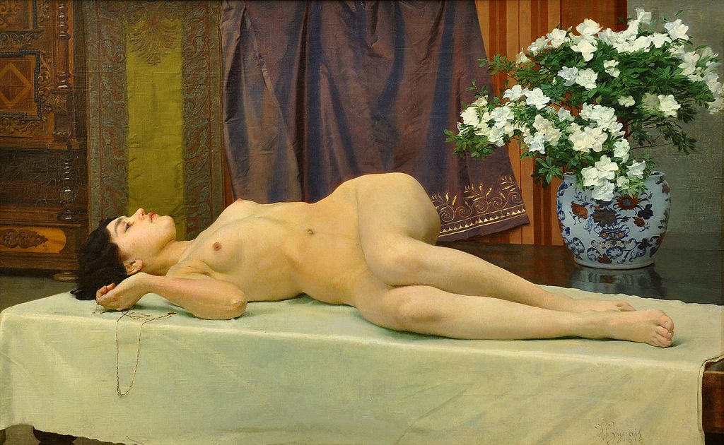
Vojtech Hynais “Lezici akt”
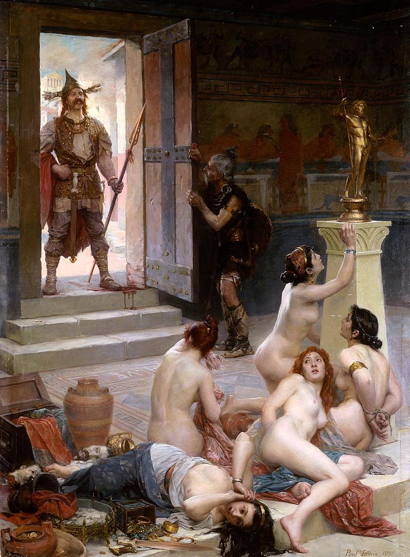
Paul Jamin “Le Brenn et sa part de butin” (1893)
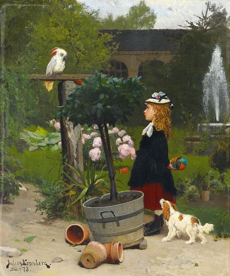
Julius Kronberg “Der neue Spielkamerad”
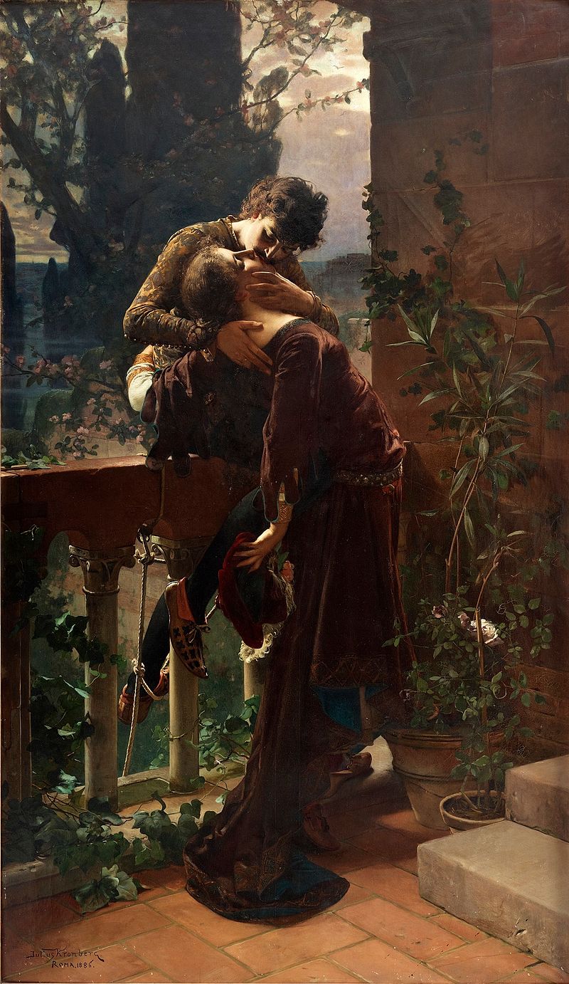
Julius Kronberg “Romeo and Juliet on the Balcony”
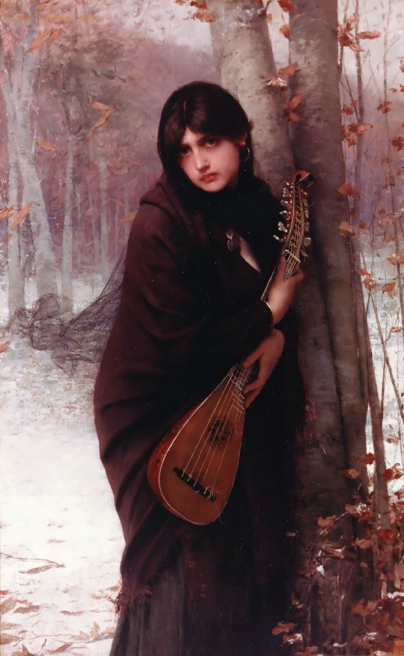
Jules Joseph Lefebvre “Girl with a Mandolin”
Jules Joseph Lefebvre “La Cigarra” (1872)
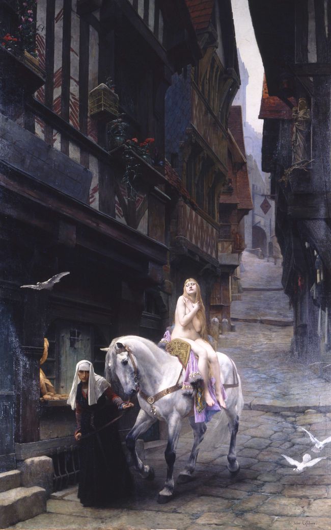
Jules Joseph Lefebvre “Lady Godiva”
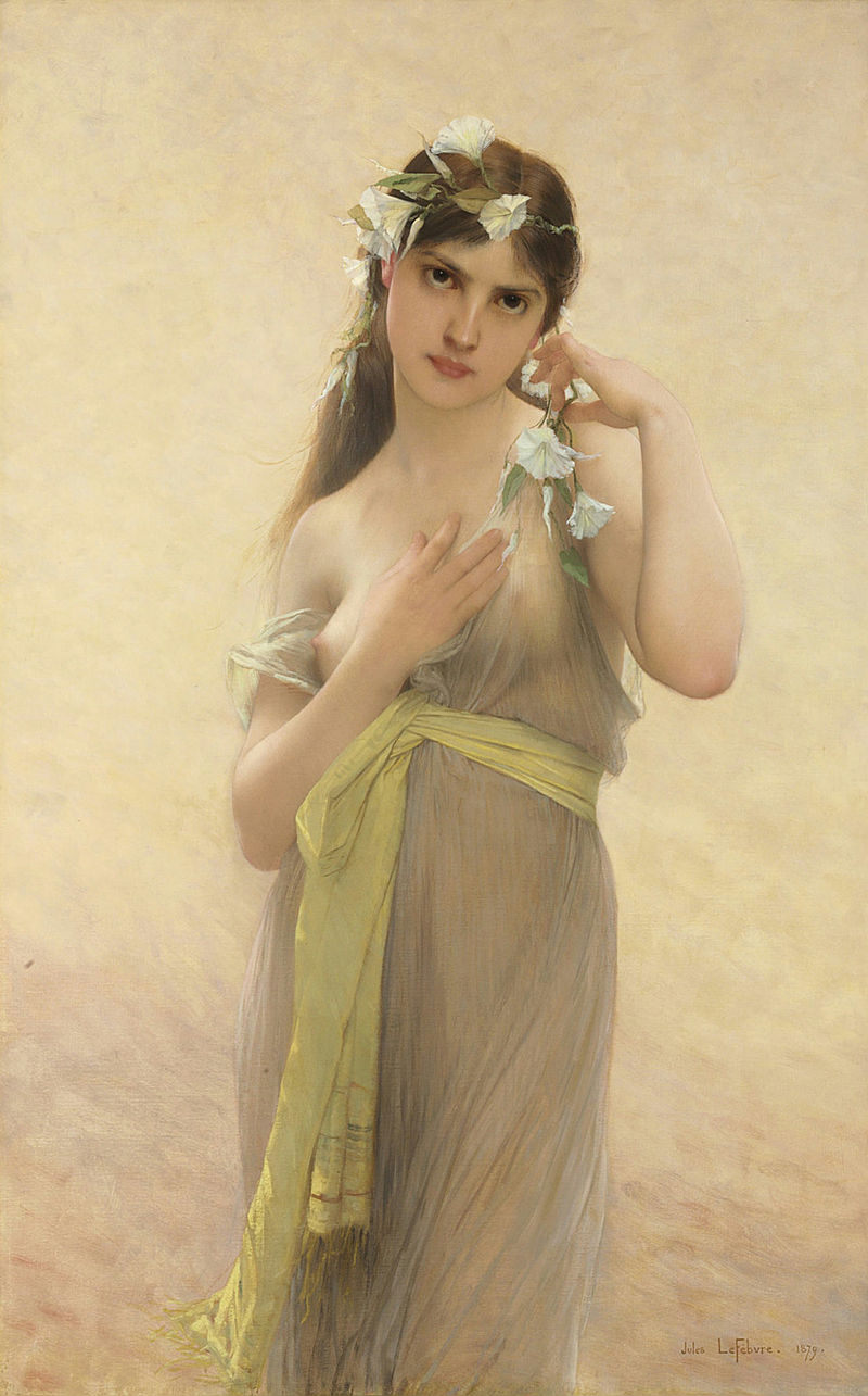
Jules Joseph Lefebvre “Morning Glory” (1879)
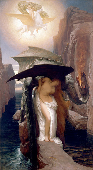
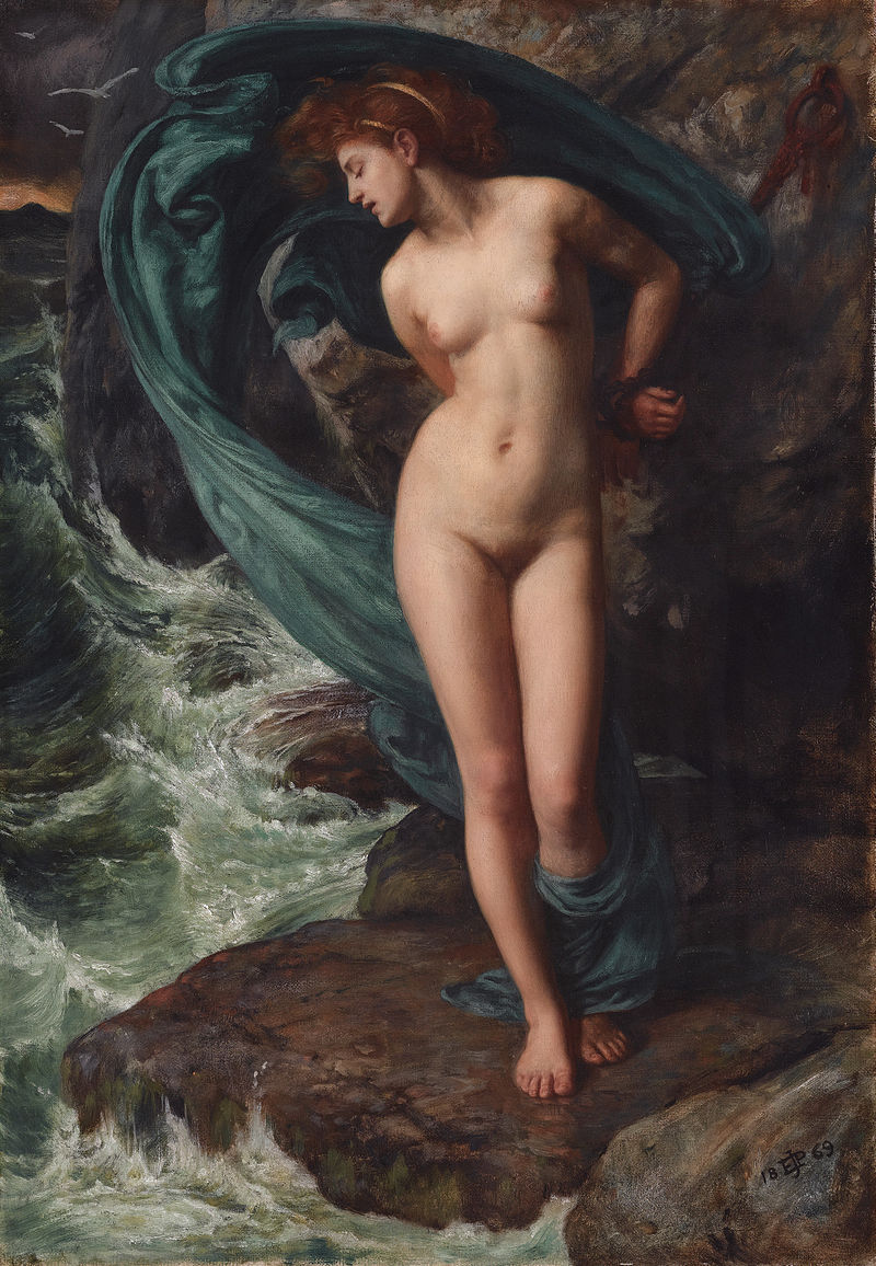
Frederic Leighton “Perseus and Andromeda”
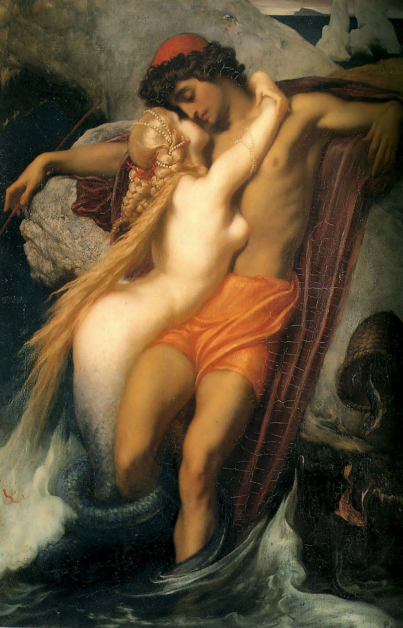
Frederic Leighton “The Fisherman and the Syren” (1856)
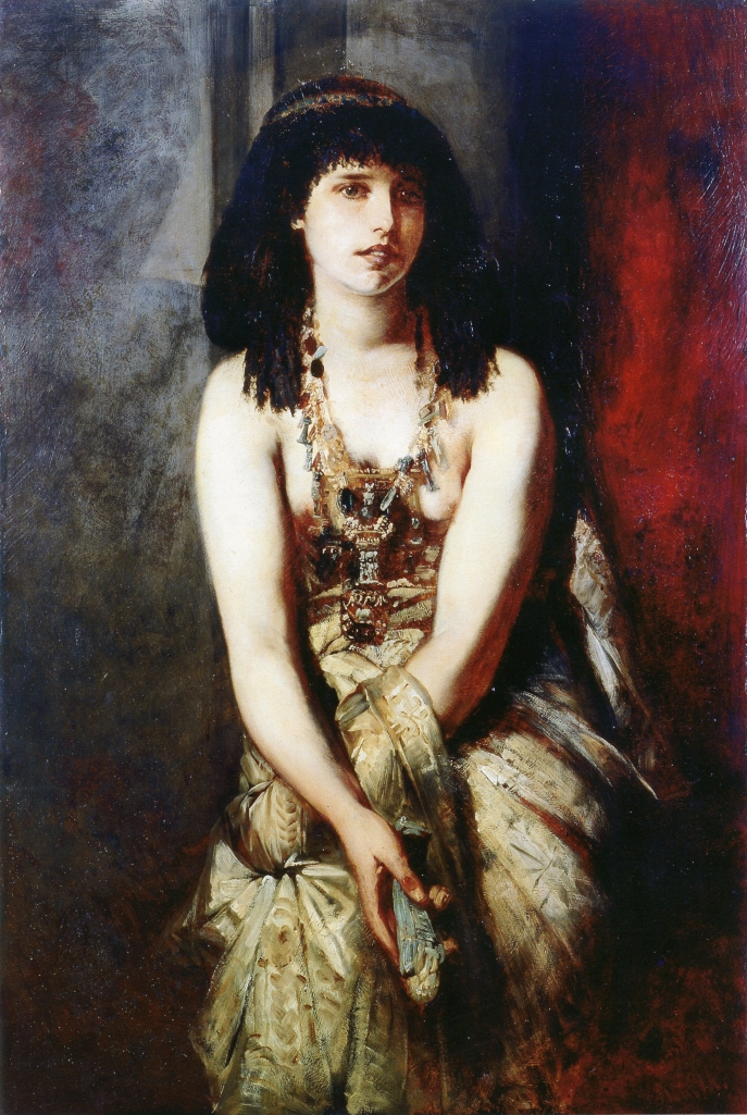
Hans Makart “An Egyptian Princess” (1875)
Hans Makart “Japanese Kimono”
Hans Makart “The Five Senses”
Hans Makart “Abundantia: the Gifts of the Sea” (1870)
Konstantin Makovsky “Allegorical Scene”
Konstantin Makovsky “Beauty Preparing to Bathe”
Konstantin Makovsky “Geburt der Aphrodite”
Konstantin Makovsky “Gypsy”
Konstantin Makovsky “Happy Arcadia”
Konstantin Makovsky “The Appeal of Minin”
Hughues Merle “Tristan and Isolde”
Hughues Merle “Hebe apres sa chute”
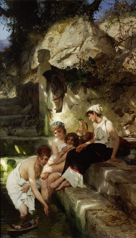
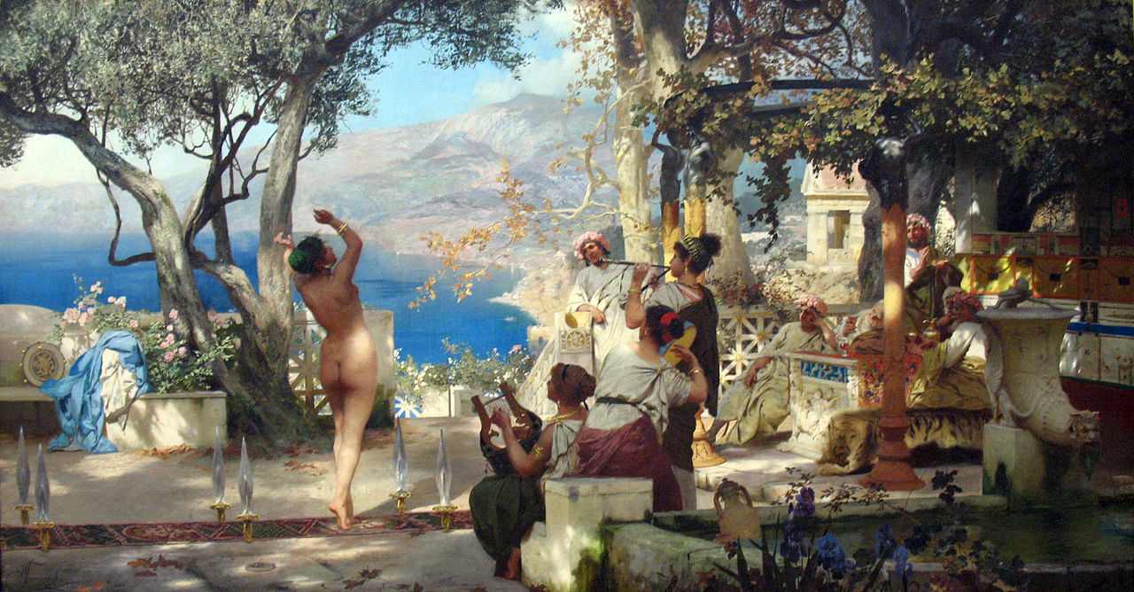
Domenico Morelli “Pompeian Bath” (1861)
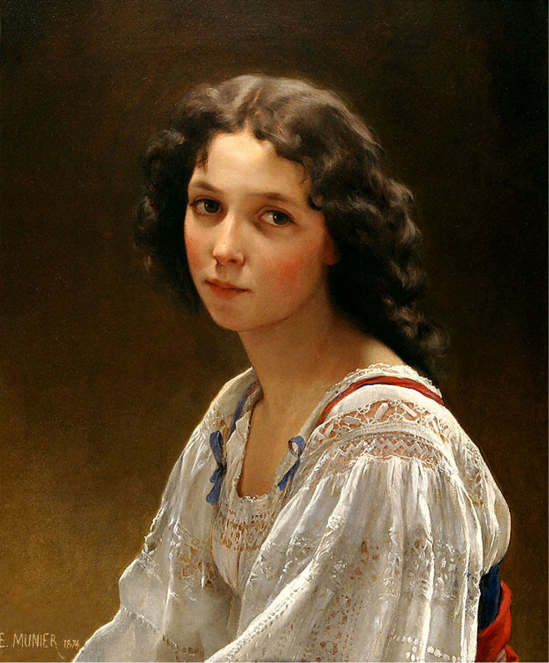
Émile Munier “Head of a Young Girl”
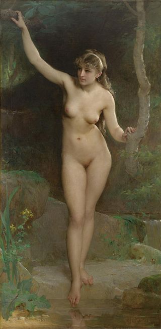
Émile Munier “La baigneuse”
Karel Ooms “Summer Fantasy”
Paul Peel “The Little Shepherdess”
Edward Poynter “Andromeda” (1869)
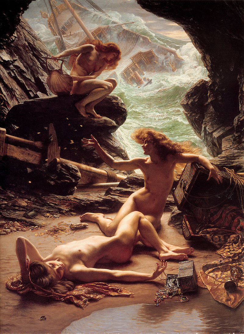
Edward Poynter “Cave of the Storm Nymphs”
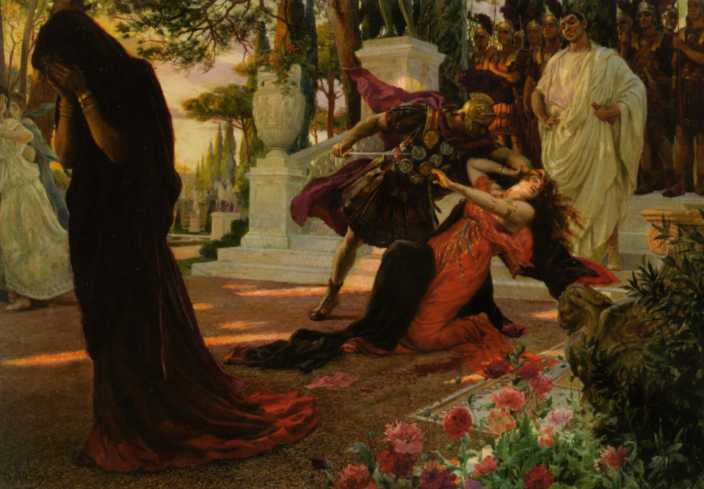
Georges Rochegrosse “The Death of Messalina” (1916)
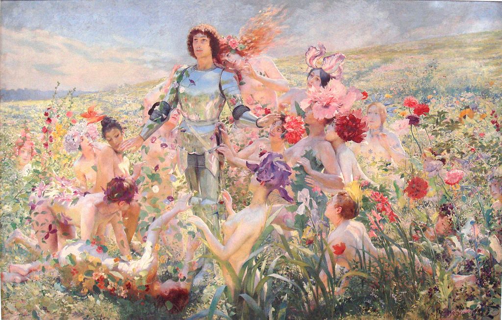
Georges Rochegrosse “Le Chevalier aux Fleurs” (1894)
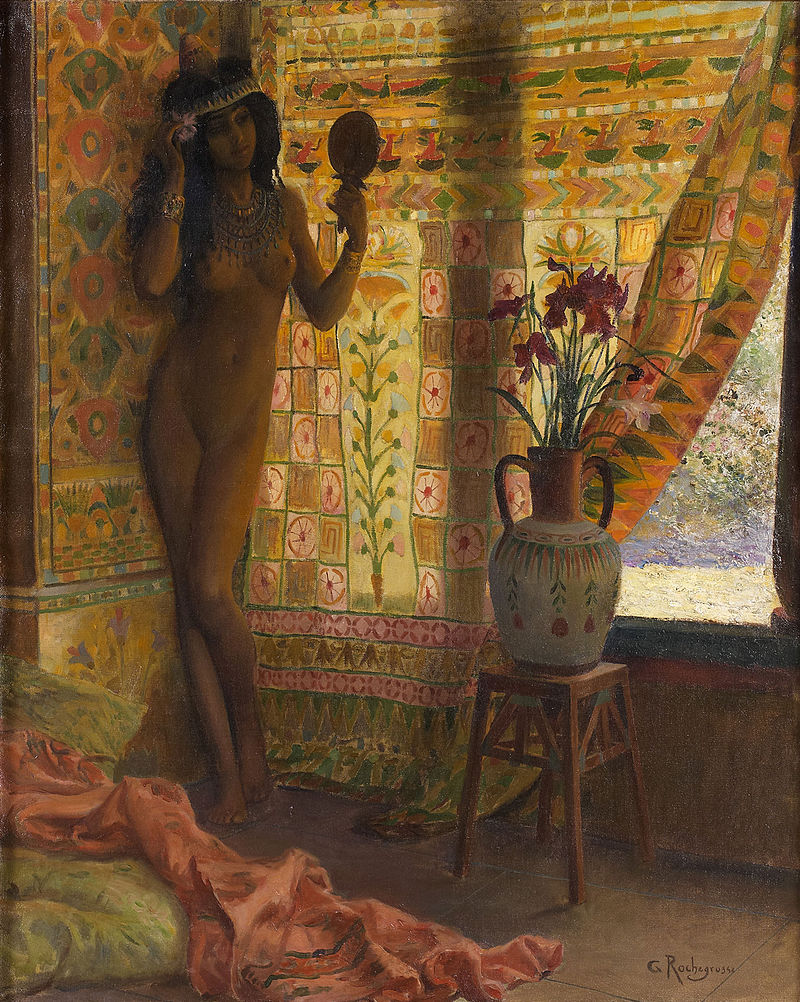
Georges Rochegrosse “The Mirror”
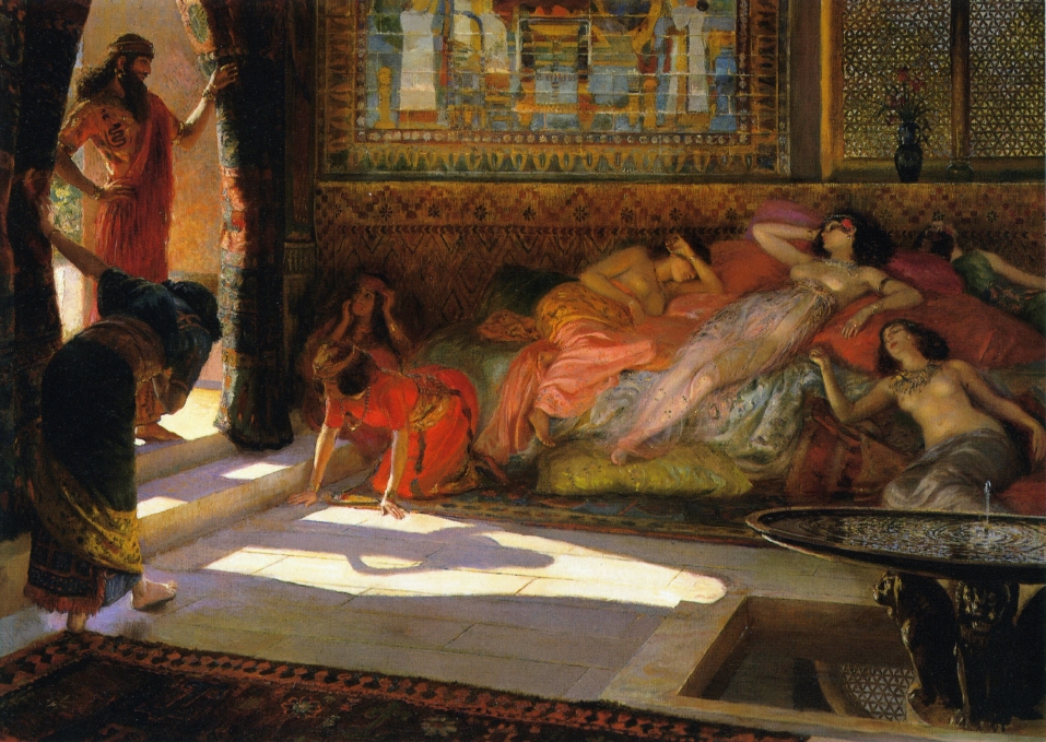
Georges Rochegrosse “The Arab Guard”
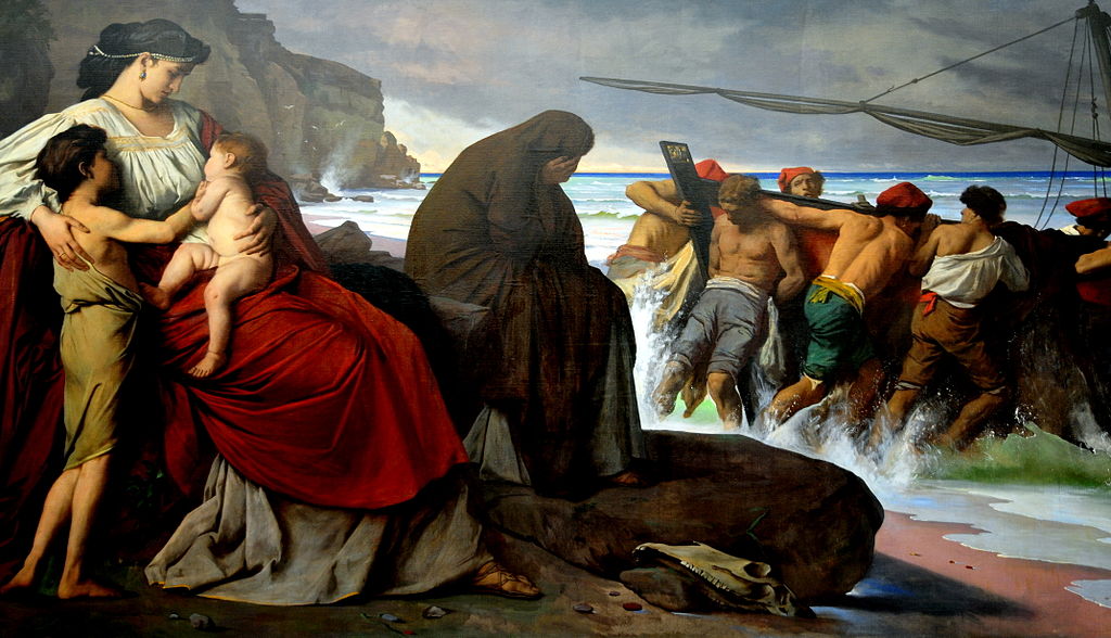
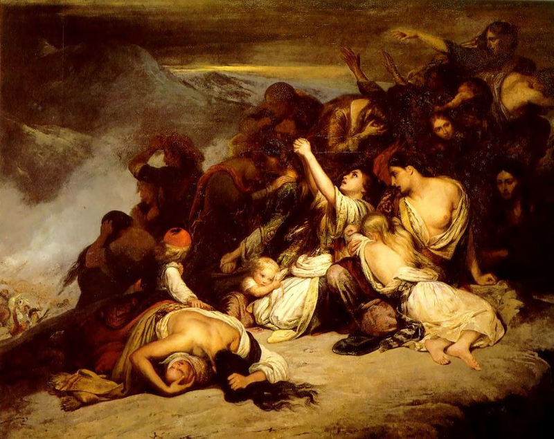
Ary Scheffer “The Souliot Women” (1827)
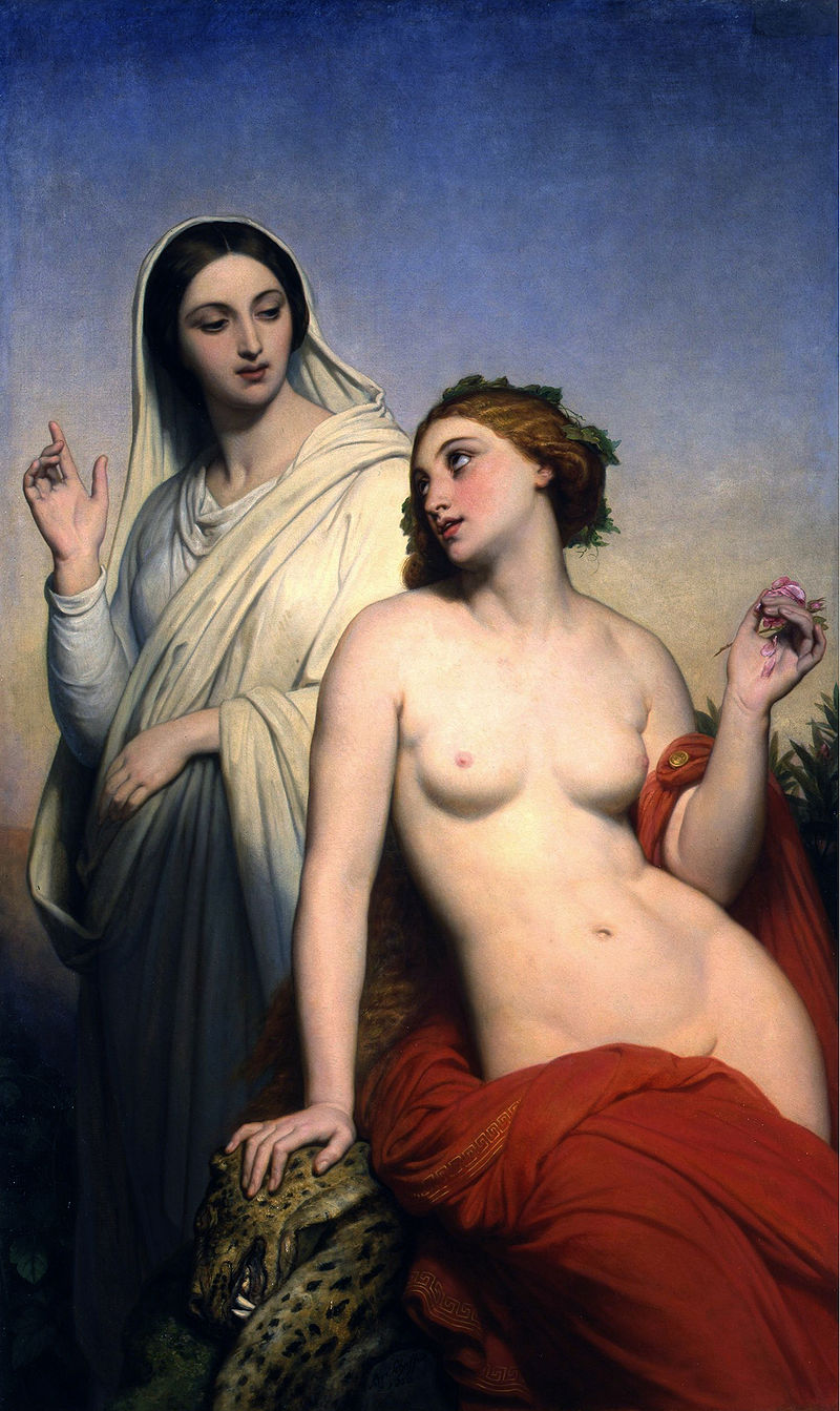
Ary Scheffer “De hemelse en aardse liefde” (1850)
Eugene Siberdt “Farewell Dear France, 15 August 1561”
Henryk Siemiradzki “Before the Bath”
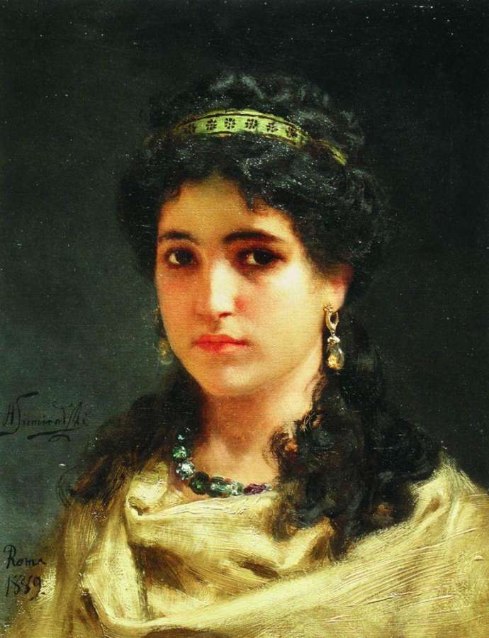
Henryk Siemiradzki “Portrait einer römischen Schönheit” (1889)
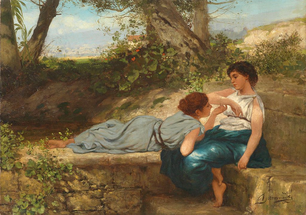
Henryk Siemiradzki “Das Gespräch”
Henryk Siemiradzki “Judgement of Paris”
Henryk Siemiradzki “Nimfa”
Henryk Siemiradzki “Tanz der Schwerter Anagoria”
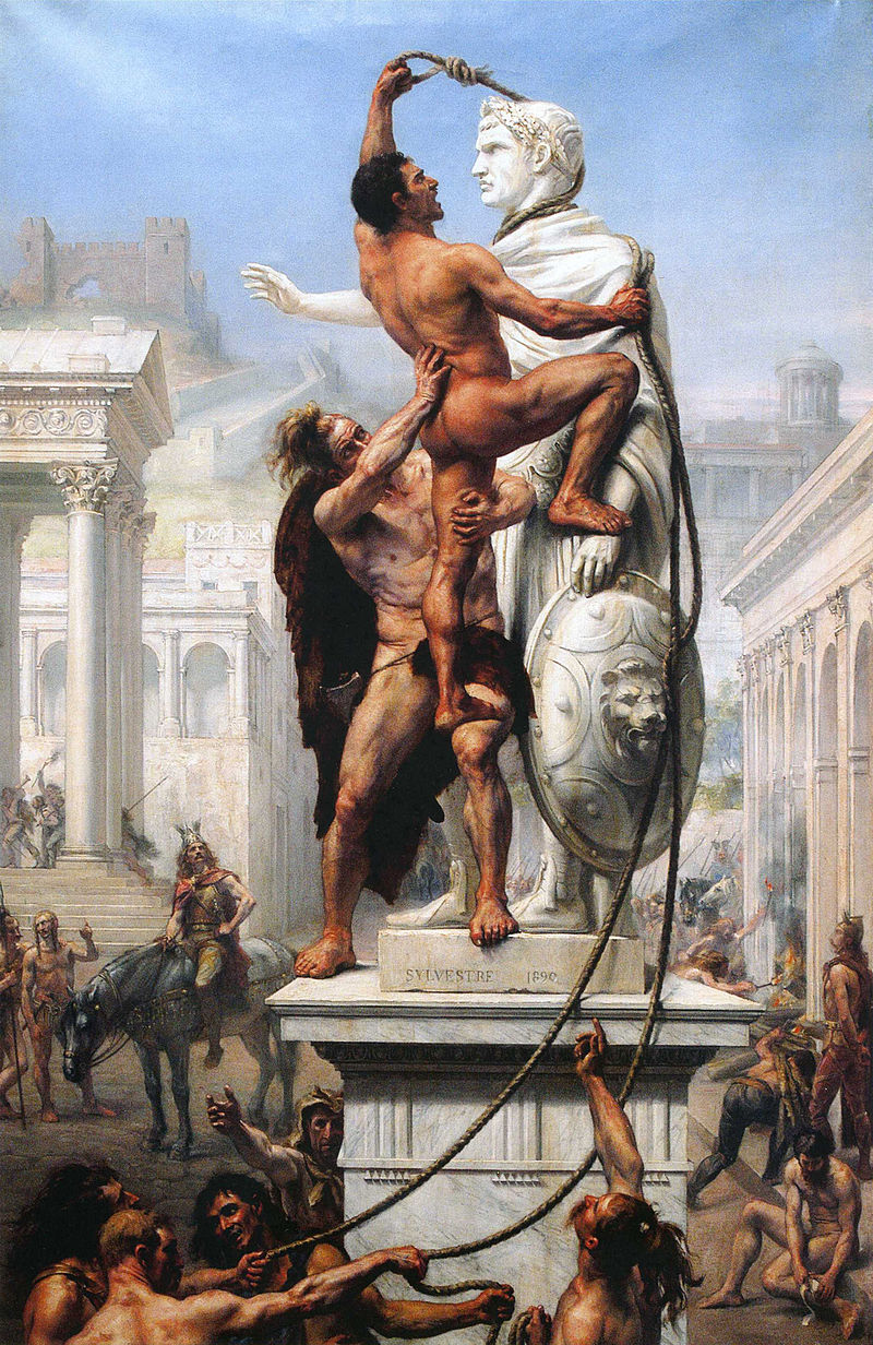
Joseph Noel Sylvestre “Visigoths Sack Rome”
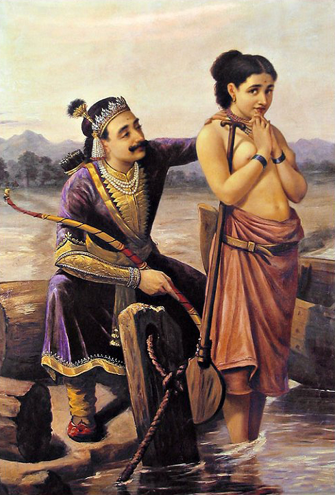
Raja Ravi Varma “Shantanu and Satyavati”
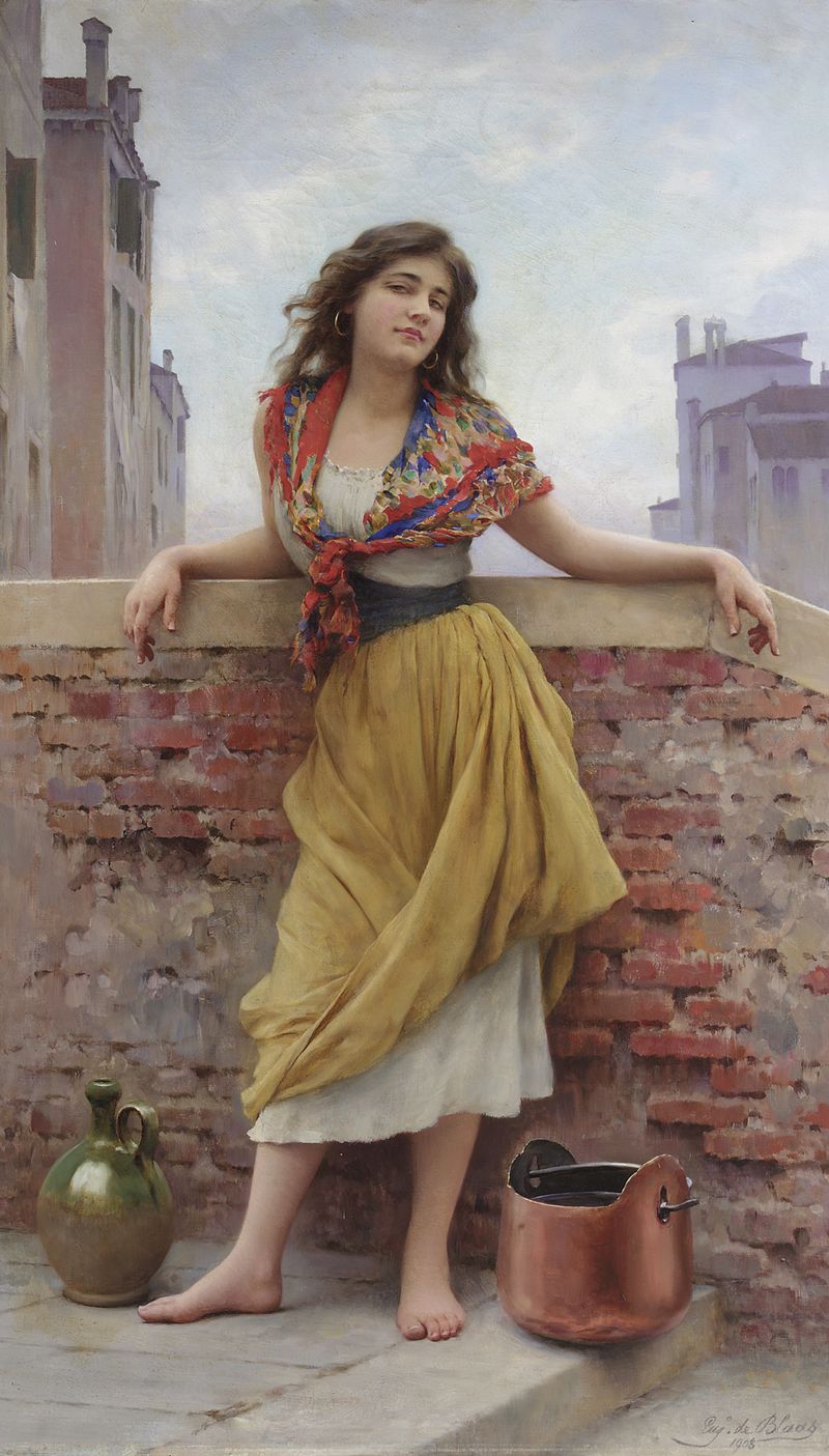
Eugen von Blaas “Die Wassertragerin”
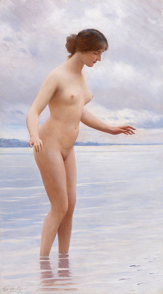
Eugen von Blaas “In the Water”
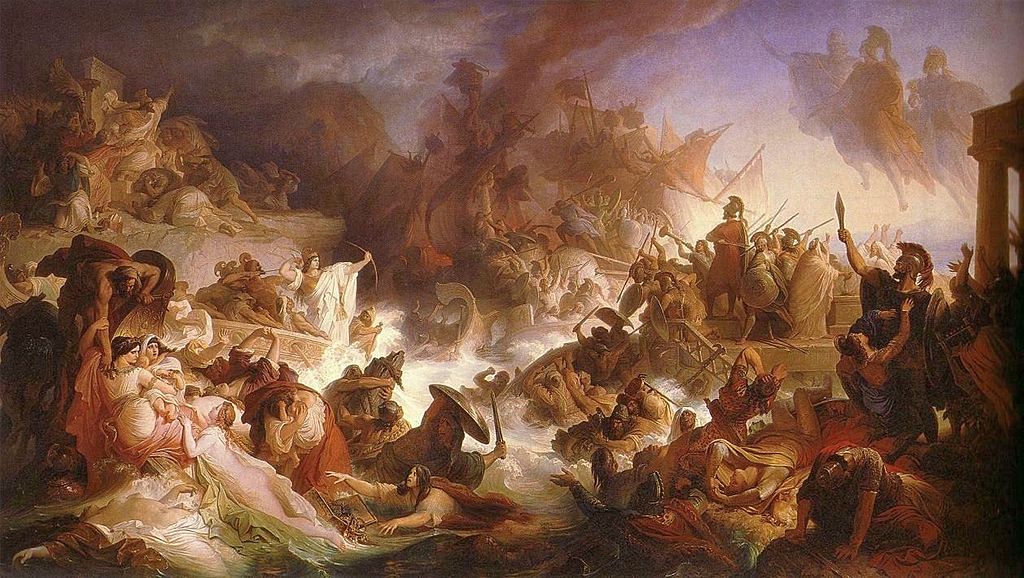
Wilhelm von Kaulbach “Die Seeschlacht bei Salamis” (1868)
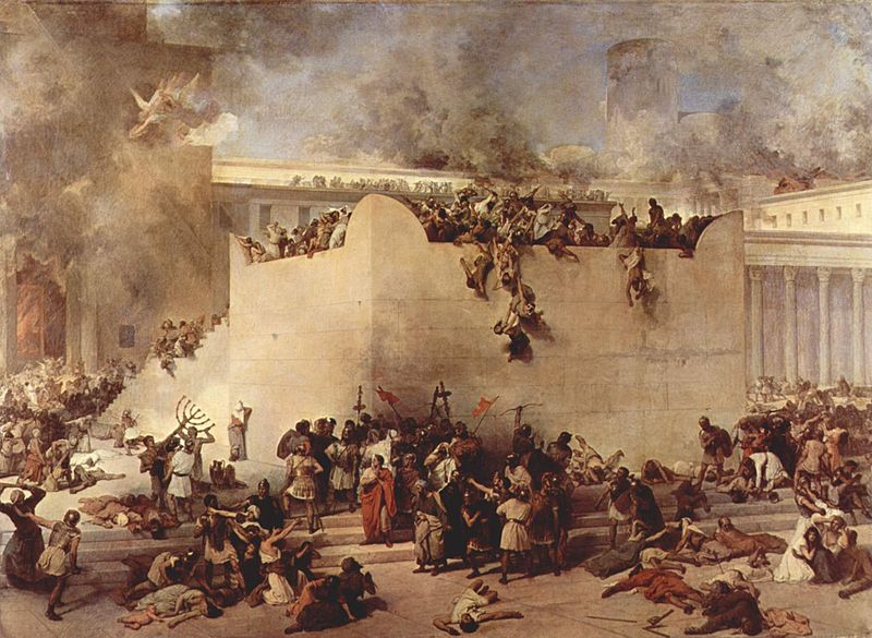
Wilhelm von Kaulbach “The Destruction of Jerusalem by Titus”
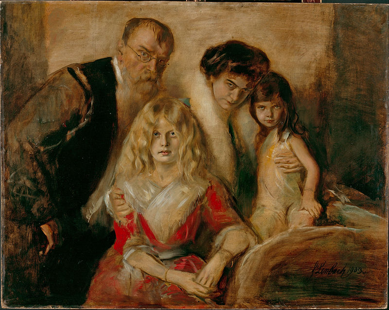
Franz von Lenbach “Family von Lenbach”
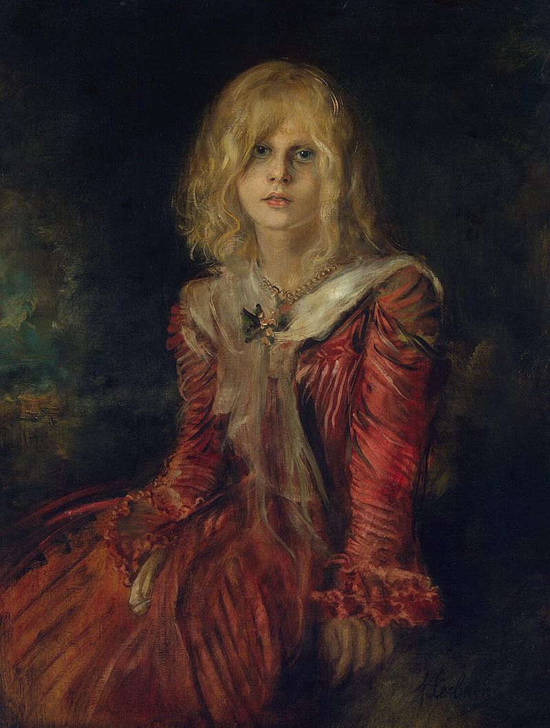
Franz von Lenbach “Porträt Marion Lenbach” (1901)
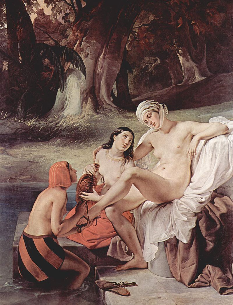
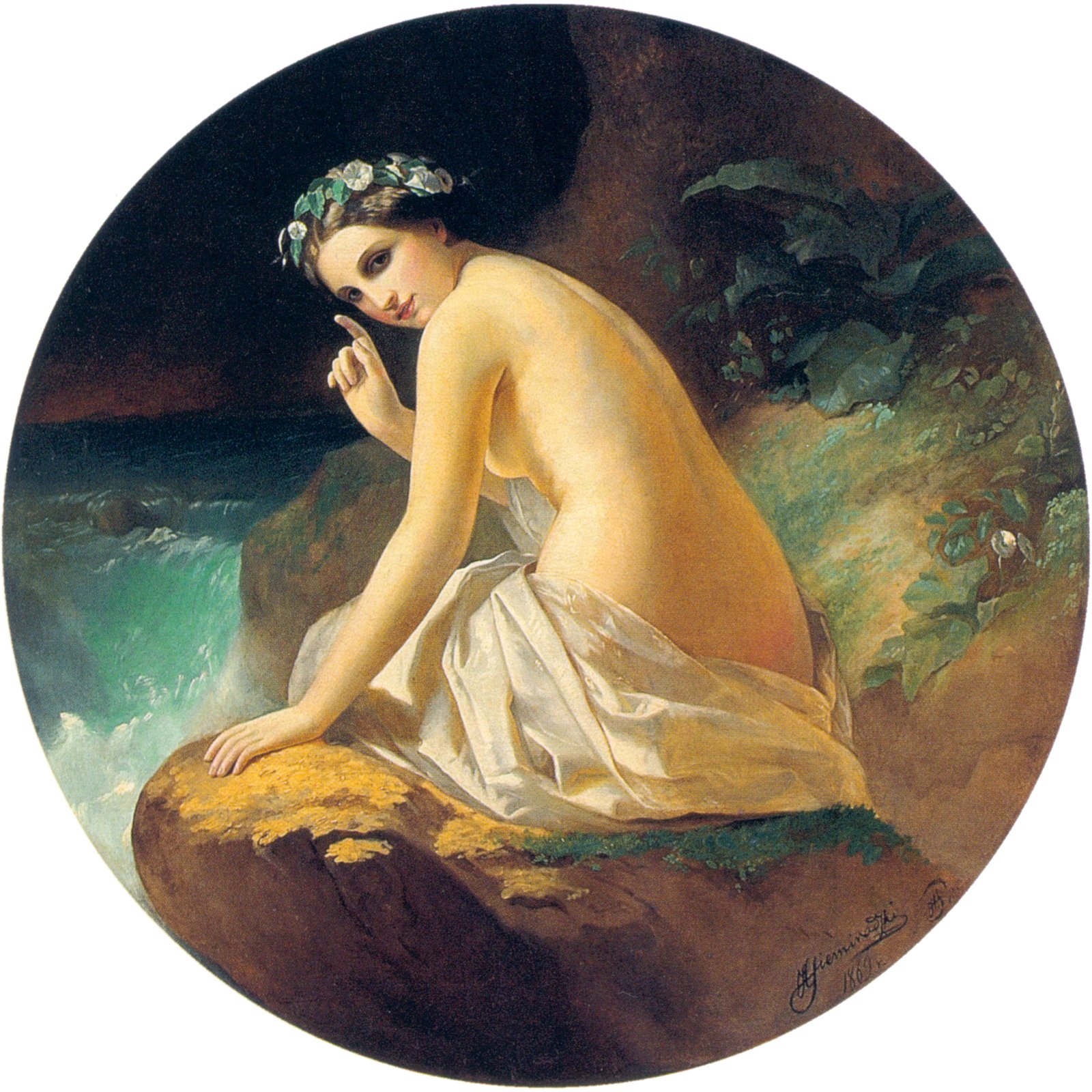
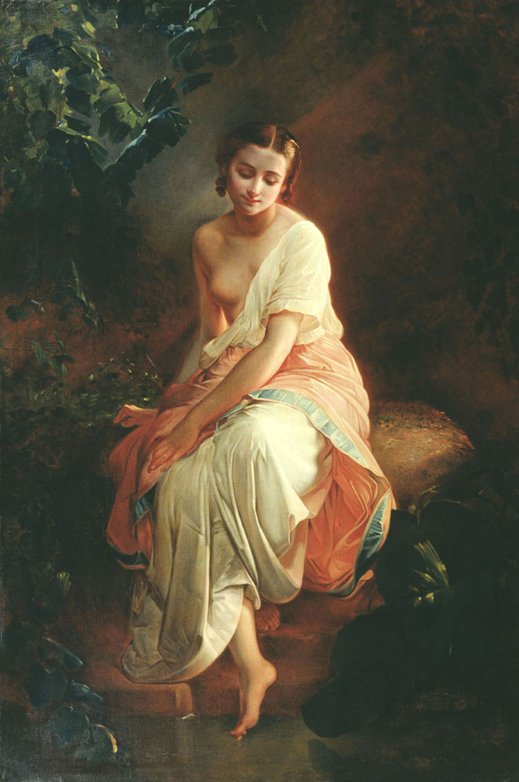
Carl Timoleon von Neff “The Bather”
Carl Timoleon von Neff “Italian Woman with Children on the Stairs”
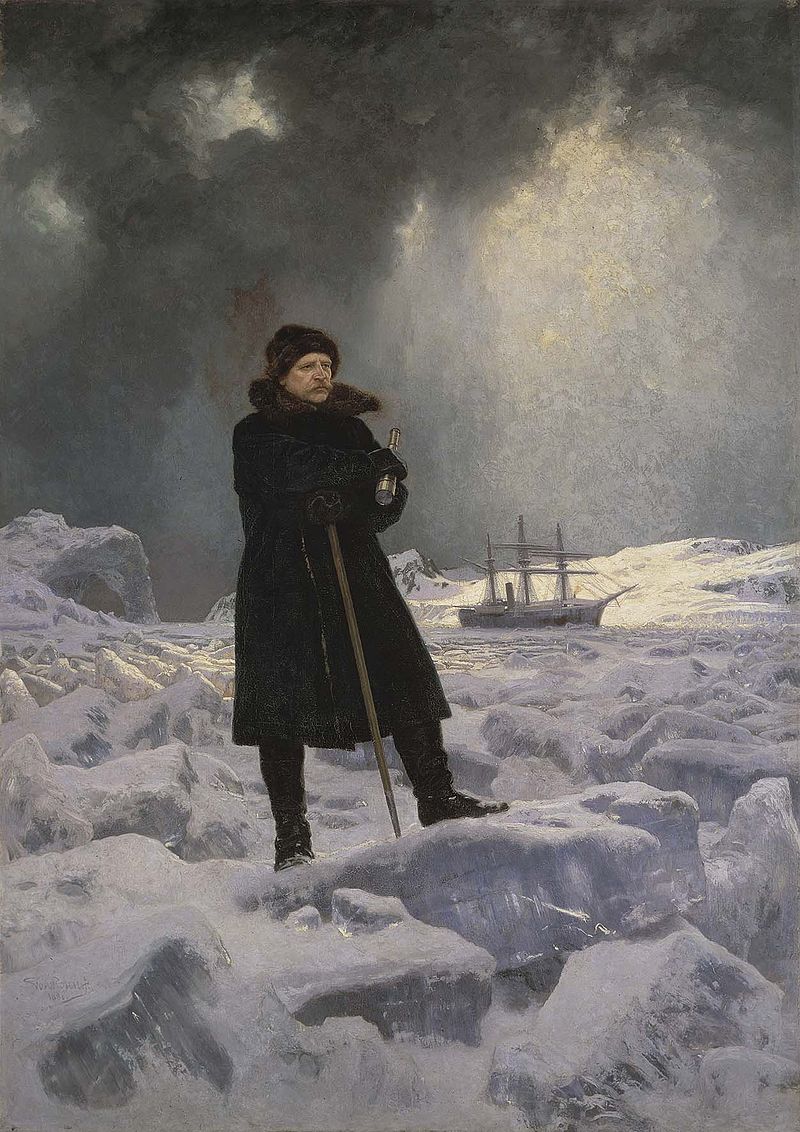
Georg von Rosen “Adolf Erik Nordenskiöld målad” (1886)
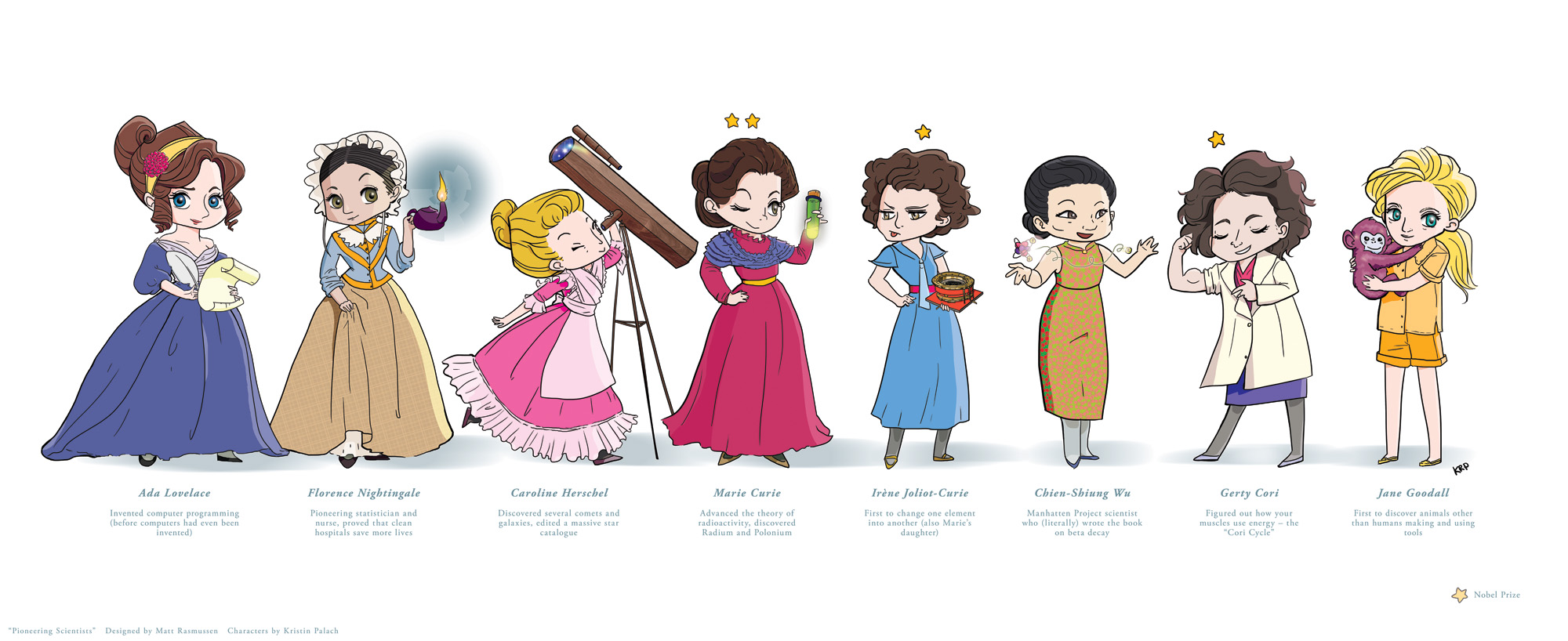
This poster is the result of a call for art for my best friend’s baby room. She had her first, a girl, the precise day in August after I dropped a framed copy of this off. The process started back in June, when I commissioned illustrator Kristin Palach to design and ink the characters. I loaded her down with a novella’s worth of notes, but Kristin was fantastic to work with, and her art is utterly squee-worthy. Colors and layout are my own.
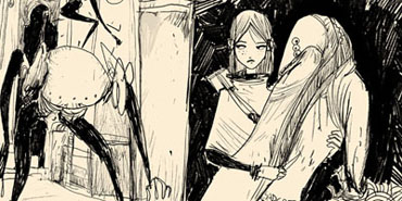
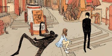
This promises to live at the kind of weird/wonderful nexus you go to indy comics for. Pirates! Parrots! Sock puppet narrators! Mermaid *cough*! Octocreatures! Sweatles! RIDICULOUSLY COMPLICATED ROPE ARTWORK! It’s almost as if Troy and Line are channeling not their notions of pirates, but their kids’ notions of playing pirates.
Line is probably the most intriguing independent comic artist in the Boston area. Her panels are dense with detail, her characters loosely formed without being careless, and her artwork suffused with a wonderfully energizing rhythm. Here’s a favorite from her blog:
It sounds like the next step for Open Fire! will be an eight page demo issue. This is shaping up to be a lot of fun.
By virtue of their printed size, long-form (Sunday) comics have a history of being difficult to translate into book form. Newspaper widths vary between about 11″x17″ (tabloid) and 18″x24″ (broadsheet), while trade paperbacks much above 8.5″x11″ (letter) become expensive to print and hard to move through retail channels. In order to allow reprinting in smaller formats and in different shapes, the modern comics page is dominated by comics with simple art and a large number of small panels. Meanwhile, dedicated comic books, which can be reprinted at the same scale and dimensions in trade paperback, have grown ever more complex and detailed. Sunday comics with ongoing storylines have disappeared, while comic book storylines grow ever richer.
Lets find a different Sunday strip format that’s easier to reprint in book form.
We assume that each artist should get the same amount of space in each edition, and that the artwork should be reproduced at roughly the same size in newspaper and book form.
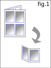
The simplest method would be to print four standard comic book pages on each page of newsprint (fig. 1), for a total of 16 comics per sheet (bifold: cover, inside left, inside right, back). Reprinting is a question of slicing each full-size page into four book pages.
Fine. Boring. The newspaper sheet looks like a set of unrelated items stuck next to each other.
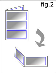
We could also do three landscape-oriented pages per sheet. (fig. 2) This would give the artist more space to work with. Reprinting would require a landscape-oriented trade paperback though, which is harder to shelve. It’s also just as boring.
If we’re reinventing the Sunday comics page, let’s come up with something more interesting.
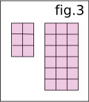
We’ll start by dividing the page into blocks. Each page of the trade paperback gets six blocks (2×3), each page of the newspaper, eighteen (3×6). (fig. 3) The blocks need not be square, but they can’t be rotated between newsprint and trade, and need to maintain a consistent aspect ratio.
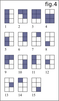
We now combine the blocks into shapes. These shapes become the working space each artist is given. Since the shapes won’t be divided up further in reprinting, the artist has freedom to use the space in any way desired — panels of all shapes and sizes, or no individual panels at all. A 2×3 block trade paperback page can be divided into fifteen pairs of contiguous shapes. (fig. 4)
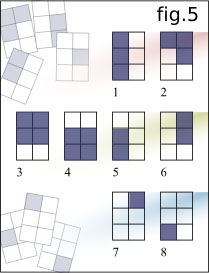
Shapes that result in an ambiguous visual flow (spots with no clear left-to-right/top-to-bottom progression) have to be discarded. This leaves us with eight shape combinations. (fig. 5)
Our goal is to give each artist the same amount of space per issue. With twelve artists per sheet of newsprint, each artist gets two sets of blocks to work with, totaling six blocks.
The eight shape sets break down into three basic categories:
Two shapes of the same size (1 & 2)
One shape with four blocks and one shape with two blocks (3, 4, 5 & 6)
One single block and one shape with five blocks (7 & 8)
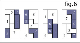
When we take the eight basic shape pairs and start trying to fit them into the 3×6 grid of the newspaper page, we begin to notice things. (fig. 6) It’s almost always possible to randomly choose one of each category and fit them together in a nice jumble, without any two shapes being fitted together in the same manner they would be in the 2×3 trade paperback. Shape pairs 3 and 4 tend to cause the exceptions, especially with 7s and 8s, often being either impossible to fit into the grid, or only working in their original positions. Neighbors in general don’t tend to work well (2/3/4, 3/4/5, 6/7/8, etc.). A great variety of interesting layouts are allowed.
As long as each artist is given two locations in each issue with a total of six blocks between them, each newsprint issue can be reprinted in book form without any alteration to or significant scaling of the original artwork. An attractively jumbled layout is produced, both for the Sunday newsprint edition and in book form.
Ralph Steadman is an underrated artist. Most only know his Hunter Thompson-era illustrations, but whereas Thompson stagnated around The Great Shark Hunt, Steadman continued to improve. Pick up a copy of Psychogeography to believe me.
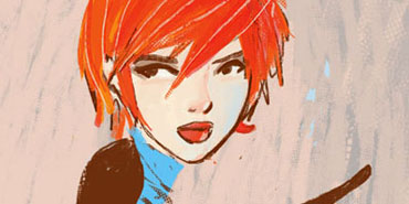
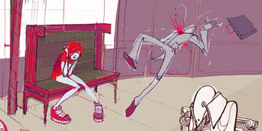
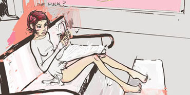
There’s a similar gift for line in Barnaby Ward’s illustrations. Ward also loves the grotesque, especially when it can be suggested with lines but never really sculpted — it’s scarier that way. Unlike Steadman, Ward equally loves “cute.”
Ward’s style is everything I usually hate, but instead I’m mancrushing. His are fashion-conscious, Vogue’d-out, eyelinered, idealized, thin and bony women suffused with ennui — and an abundance of personality. I love his lines. As much as Ward digs busyness, his focal players cram a ridiculous amount of character into very few strokes. It’s something I’ve always admired about Heidi Sullivan’s linework, though Ward is much darker. Ward frequently lets the mis en scene speak for his characters, which further boosts his credentials as a closet minimalist.


