Tiling 3D Noise in Blender

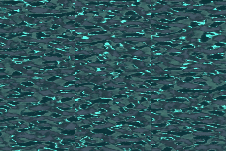
My game “Lillie is the Keeper” needed a small-scale ripple texture for an ocean shader. The in-game shader makes use of a 3d texture, UV sampled in world space horizontally, with the sampler moving up through the texture’s z axis over time to animate it. A first version used the old 4d rotation trick for repeating noise, in which a 4-dimensional noise texture is rotated 360 degrees around the Lovecraftian W axis between UVs 0 and 1. It tiled horizontally, but when the 3d texture repeated (up the z axis) there was an ugly little crossfade between unrelated frames.

I use Bforartists, a UI-focused fork of Blender, for 3d graphics and some texture creation–like this project. It doesn’t fix every pain point, but I can’t recommend it highly enough. This method, and the attached .blend file, will work just the same in mainline Blender.
As there’s no 5d noise function in the shader nodes (Shading tab), for the improved ripple texture we must go back to fundamentals. Ken Perlin’s original version of a solid texture–Perlin Noise–has a lot of complicated math behind it, but geometrically is pretty straightforward: Create a 3d grid, place a point at a pseudorandom location within each box, and apply a function to smoothly interpolate between the points in all three dimensions. (As best I understand it, Perlin’s own improvement, Simplex Noise, replaces the grid with tetrahedrons–triangular pyramids–but that’s at least Whisperer-in-Darkness-grade math for me.)

There is a shader node that can perform similar interpolation: Point Density. Note that you’ll have to switch your renderer to Cycles in order to use it. In Eevee it’ll just output black. This is poorly documented and the interface won’t help you.

The Point Density node takes the vertices of a mesh (or particles of a particle system) and outputs a greyscale representation of their density. With it, it’s possible to create noise from your own handmade 3d grid of points–like an array of cubes. Since you’re creating the vertices yourself, making them repeat is as simple as replicating them in x, y and z–for instance, with three Array modifiers.

To start out, create a 1x1x1 cube. Pop into Edit Mode and set the cube’s origin to its leftmost, bottom-most, hindmost vertex. Back in Object Mode, move it to -1.5, -1.5, -1.5. Just one cube (8 points) won’t look like much as noise, so we’ll double it in all three dimensions. Scale your cube to 0.5, 0.5, 0.5. Now double it in X, Y and Z with three Array modifiers: Add an Array modifier, set the Count to 2, and the Relative Offset’s Factor X to 2. Add two more Array modifiers, for the Y and Z axes (Relative Offset Factor Y to 2 on the second, and Z to 2 on the third).

We can randomize our cubes’ vertex positions with another modifier: Displacement deforms the mesh based on a texture. The app can generate this noise texture for you. Go to Texture Properties, create a new Texture, set the type to “Clouds,” and select “Color” rather than “Greyscale.” Go back to your cubes’ modifiers, add a Displacement modifier (after the three Array modifiers), set the Coordinates to “Global,” the Direction to “RGB to XYZ” and the space to “Local.” Play with the Strength and Midlevel properties if you want more distortion in your cubes.

A cube of (distorted) cubes

Now you’ve got a box of eight distorted cubes, sort of down in the lower left-hand corner of the world axis. Let’s replicate them with three further Array modifiers: After your Displacement modifier, add an Array, and set the Count to 3. Since the Displacement modifiers are messing with the overall dimensions of the cubes, deselect Relative Offset and select Constant Offset. Set Distance X to 2. Now, make two more Array modifiers, for Y and Z, also with Constant Offset Distance 2 (in Y and Z respectively). You should now have a repeating set of distorted cubes in all 3 dimensions.

Hide your cubes (including from renders–the camera icon in the outliner). Create a 1×1 plane at the origin. Delete any lights in your scene. Set the camera’s output to a texture-friendly square, like 512×512 pixels (printer icon, Resolution). Set the camera to Orthographic (camera icon, Lens: Type) and aim it straight on to your plane. Create a new Material on the plane (material ball icon, New).

Switch to the Shading tab with your new Material, delete the “Principled BSDF” node, and instead add a “Point Density” node. Select “Object Vertices” rather than “Particle System.” Under Object, select your mesh of repeating distorted cubes. Set the Space to “World Space,” the Radius to 0.5, and the Interpolation to “Cubic.” Drag the node’s Density output straight to the Material Output node’s Surface input.
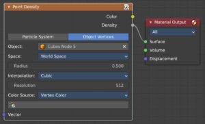
Shader nodes

That’s it, in a nutshell. Move your plane between -0.5 and 0.5 Z, and the noise pattern will repeat. It’ll also wrap around at the X and Y edges.

You can create finer-grained noise by doubling your cubes and halving their scale. Or double-doubling and half-halving. Or double-double-doubling… You get the idea. For each iteration, half the scale, double the Count of your first 3 modifiers, then double the distance between them with your last 3 modifiers. I also recommend halving the Size attribute of your Clouds texture each time.

Note that at larger numbers of cubes (say 16 or 32 per box) the “Point Density” node’s Resolution attribute will need to be increased. Add 100 at a time, until there’s no visible difference adding 100 more. Accept the hit in performance. (If you see seams in the final rendered texture, too low a Resolution setting here is usually the culprit.)

Download the Bforartists/Blender file here: Repeated Tiled Noise v2.blend

In the file, the Demo collection will demonstrate the simple version, while the Production collection is my final water ripples setup. In the simple version, there are also some unused shader nodes demonstrating a setup for combining noise at different scales to create more complex output–again, just like Perlin Noise.

The Production collection, my own version for water ripples, does a few additional things. I’m creating the 3d texture in Unity, which requires each frame (vertical slice of the 3d noise) to be stacked side-by-side in a single image file. As such, I’ve added an Array modifier to the plane I’m rendering, so that it becomes 16 side-by-side squares stepping up between -0.5 and (almost) 0.5. (Almost 0.5, because step 17 would be 0.5–and we don’t want to repeat a frame. The app will do basic math when setting fields numerically, so entering “1/16” will give you 0.0625…) The orthographic camera is adjusted to render it all in one frame. Within the shader graph, I’ve made the position Vector fed into the “Point Density” node a combination of the world Z coordinate and the planes’ UV coordinates (standing in for X and Y). Since I want a lot less change as the noise loops in the Z axis than in the horizontal directions, I’ve not halved the number and scale of the cubes along the Z axis, and I’ve split the Displacement modifiers’ textures into three different Greyscale textures accordingly. There’s an RGB Curves node added after the Point Density node to make the interpolation more wave-like. Finally, the greyscale heights have been translated into a Normal Map via a Bump node.

Smooth sailing!

Admiral Bulletin 2.0

Admiral Bulletin is a storytelling game. Players choose locations and follow prompts on Event Cards to collaboratively tell a ’30s pulp adventure story. Players can reward one another for especially entertaining additions. The game is 100% free and can be printed at home, as well as supporting online play over video chat.

Players:

2+ (ages 12 and up)

You’ll Need:

  • 16 Character Cards (Gold)
  • 32 Event Cards (Blue)
  • 3 Chapter Sheets (Acts I, II & III)
  • A handful of counters (glass beads, coins, etc.)
  • A pen
  • A bit of scrap paper, or your phones

Setting Up:

Give everyone 3 counters, and leave the rest in the center. Put out the Act I Chapter Sheet.

If there are Characters people don’t want to use in this story, remove them from the deck. Pull the Character Cards for Bulletin and Miranda out, as they’ll be required in Chapter 2. Shuffle the rest of the Character Card Deck.

If there are Events people don’t want to use, remove them from the deck. Shuffle the Event Card deck.

Everyone now writes down 3 Locations:

  • 1 specific (Paris, Asia, Tiffany’s, etc.)
  • 1 vague (at sea, on a train, etc.)
  • 1 more of the player’s choice

The starting player is the person who most recently finished a novel.

Beginning a Chapter:

Unless the Chapter already has a Location filled in, the starting player chooses one of their Locations, adds it to the space on the Chapter Sheet, and announces it to the other players. Locations can be used more than once.

If the Chapter has one or more empty Event Card slots, draw cards from the Event Card deck to fill the slot(s). Many Chapters come with Event “Cards” of their own. If Event Cards say to add Characters, draw the appropriate Character Cards and add them to the Character Pool before starting the Chapter. Otherwise, the Event Cards will guide your storytelling during the telling of the Chapter.

When ready, the starting player slides their first counter forward and begins speaking. Until the end of the Chapter, the only spoken words should be story content.

Telling:

When it’s your turn, you push the first of your 3 counters forward, and begin speaking. Each counter represents one natural, speaking breath (roughly a sentence). You speak all 3 breaths, and then take your 3 counters back as the next player begins.

If playing over video chat, you can hold the counters in your hand, or just use your fingers as “counters.”

The Character Pool reminds you of the recurring characters in the story, all of which are available for use. One-off characters and henchmen are yours to invent as you go, but shouldn’t persist beyond the current Chapter.

1 Up:

If you particularly like what someone adds, you can reward them with an additional counter (from the center). They can use this on their next round, though it doesn’t come back after they’ve spent it like the original 3 counters do.

On video chat, type the person’s initial into the chat window to give them a 1 Up.

Ending a Chapter:

When the Chapter reaches a good stopping point, push all three of your counters into the center without speaking. The Chapter ends.

The next player now becomes the starting player. They select a Location, draw cards as needed, and begin.

Keep in Mind:

  • Have fun! It’s not a competition.
  • Let the story decide where to go.
  • Don’t race to the end.
  • This is improv: “Yes and…” one another.
  • Use the cast.
  • When in doubt, character quips.
  • You’re doing better than you think.
  • Have fun!

Download

Admiral Bulletin v2 beta 1

Solus: 2.5D Character Control & Footprints

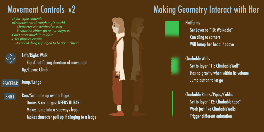
The protagonist (we never came up with a name for her) moves along a 2D plane in a 3D environment, with generally realistic platforming movement inspired by Flashback: The Quest For Identity.  The system uses the Unity physics engine, manually controlling the character’s momentum to create grabbing and climbing, and adds quadratic drag for “crunchier” falling per Bennet Foddy’s 2015 GDC lecture. I started by modifying an existing character control script, the final system ended up a complete rewrite.

Character interaction is controlled with Layers. If an object has a Collider and is in Layer “Walkable,” the protagonist can traverse it, including ledge grabbing when appropriate. Rope climbing is the same, only with Layer “ClimbableRope.” (Wall climbing was also implemented, but cut for time.)

Want to play with it? You can download the Unity package here. Feel free to use the controller scripts & prefab setup for whatever you’d like (but not Anastasia Jacobsen’s cute character model please!)

Footprints are based on the method used in Röki. At the animation frames of the walking and running cycles where the foot first makes contact with the ground, an animation event is called with a boolean indicating left or right foot. A Projector Prefab with a Normal Map Texture is then instantiated at the location of the foot’s Bone. The Prefab has its own script, which fades the Normal Map out over 10 seconds, and then self-deletes.

The Solus demo is available on to download and play on Itch.io (Mac & Windows).

Solus: Lighting Up the Desert

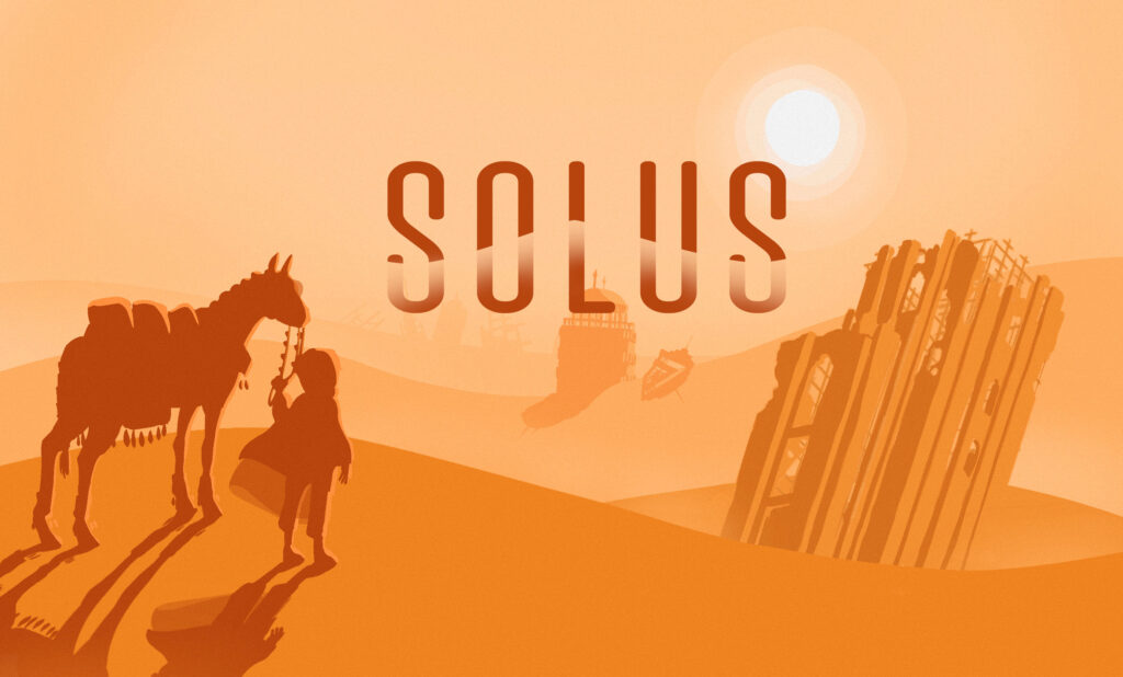
Anastasia Jacobsen’s concept for Solus is an attempt at a semi-hard-sci-fi take on Alex McDowell’s “Planet JUNK” collaboration. The Earth has somehow stopped rotating, creating a 6 month summer/winter cycle and migrating the oceans away from the equator.

Logo art by Anastasia Jacobsen

In the demo, the player journeys down into the sand-buried remains of a skyscraper looking for water. For visual interest (and irony) I suggested the Futurist city of Brasilia which went over well with the team: Niek Meffert, Anastasia Jacobsen, Rosa Friholm, Ida Lilja, and myself. I was Technical Artist and Lighting Designer. (Solus was the first of two Planet JUNK collaborations. Many lessons learned were later applied to Shrooms.)

Solus uses Unity’s High Definition Rendering Pipeline (HDRI), allowing a wide variety of realistic volumetric effects—the simulation of light’s interaction with microscopic particles suspended in air, like smoke, water droplets and dust.

Desert scenes may never escape from Journey’s long shadow…

Topside, the lighting is very simple. There’s a Directional Light (sun) and not much else. Fill lighting is created by Global Illumination from the skybox. Blowing sand is created with the Unity VFX Graph. A number of post-processing effects are added, including Bloom, Tonemapping, Color Curve adjustments (for a more cinematic “desert” look) and a custom sparkle shader in the brightest areas. A faint volumetric Fog pervades the scene, to create a dusty atmosphere. Slightly behind the main plane of action, a second “thicker” Fog Volume is added, faded from bottom to top, to make the background distances appear greater and create a Bryce-like height fog effect.

Thank you, anonymous graffito

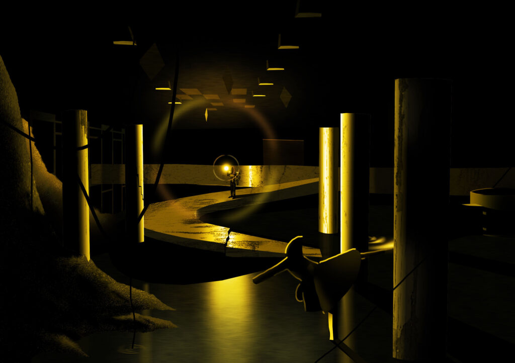
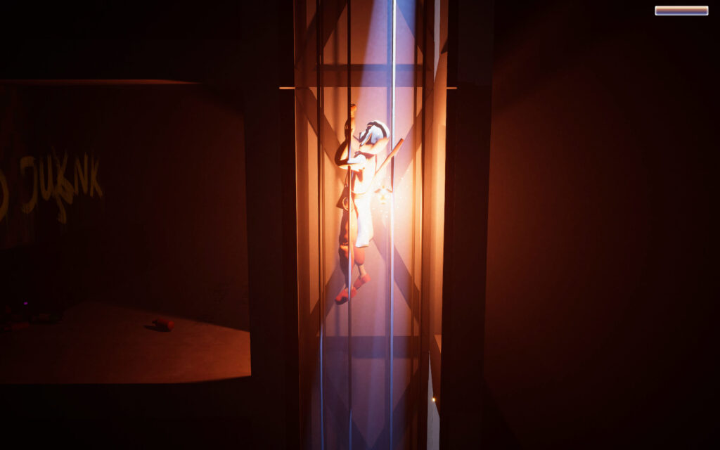
The underground lighting is primarily driven by a Point Light attached to the character’s lantern. The Volumetric Fog is thicker, increasing with depth into the buried skyscraper. An extremely bright Spot Light shines in through the entrance, volumetric and colored bright blue to contrast with the warmer lantern light. A similar, very narrow bright blue Spot Light shines down from the top of the first elevator shaft, as if a tiny stab of sunlight were blazing in through a chink in the roof. Farther down, mushrooms glow with an eerie green Emissive Material, casting light onto their surroundings via covert green Area Lights.

The theatrical darkness demanded that a final Light be added, to only be activated while editing the scene—literally named “Work Light.”

The Solus demo is available on to download and play on Itch.io (Mac & Windows).

Shrooms: HDRP in URP

The Shrooms demo runs on Unity’s mobile-friendly Universal Render Pipeline (URP), which doesn’t support volumetric fog and lighting like the High Definition Rendering Pipeline (HDRP). An early design decision was to lock the camera to only about 20 degrees of rotation off the default view axis. This allows many computationally-inexpensive (oldschool) cheats and tricks to create rich atmosphere. My mantra was: “HDRP in URP.”

Lighting

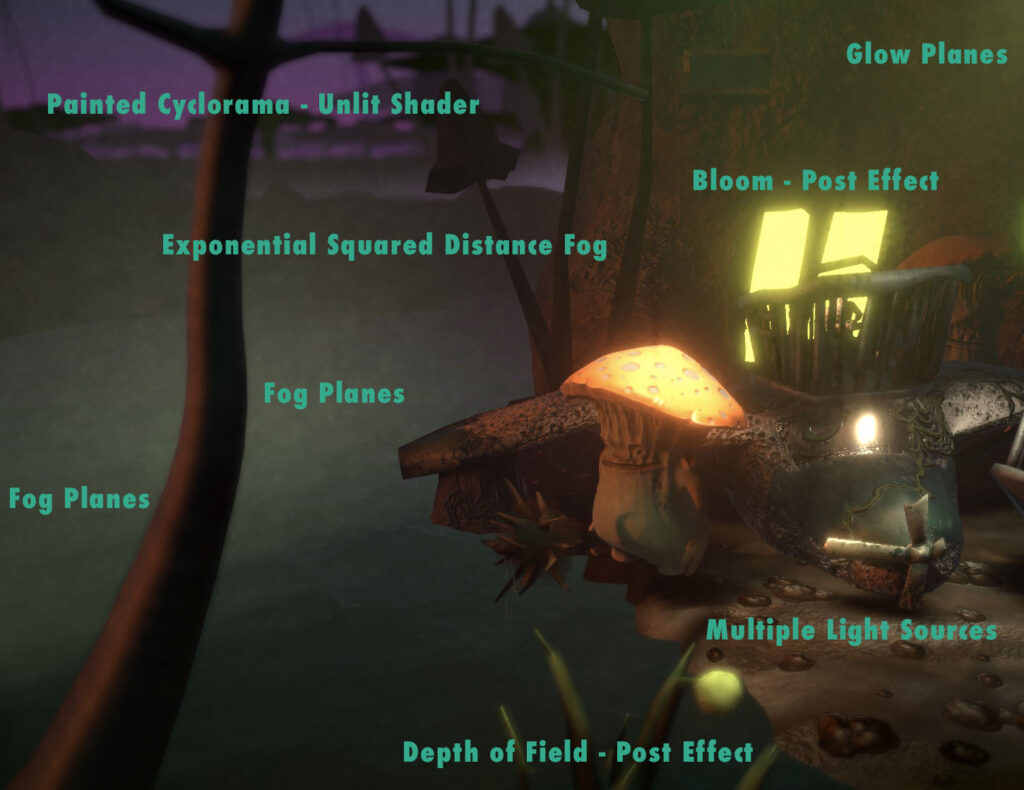
 In the Shrooms world, lightbulb is a job. Every light source is a glowing, bioluminescent mushroom person. The Copenhagen-inspired strings of street lamps that draw the viewer through the level each contain an animated Bulb Guy (created by Niek Meffert) sitting in a little wire gondola underneath a beat-up reflector. It’s a living.

He/she, and the remainder of the lamp, are set to not cast shadows, and contain a downward-facing  Spot Light. There are 37 in all, in addition to a wan Directional Light sun from the left—which is a problem, because Unity’s URP has a hard limit of 8 lights per mesh. The Unity Terrain tool splits the ground into a couple dozen smaller tiles, but the initial result was most of the light sources being simply ignored by the ground mesh, and glows often visibly sliced off where they crossed tile boundaries. Baked Lightmaps and realtime lighting in URP both share the lights-per-mesh limit.

Quick & dirty normal map in Photoshop: Filter > Other > High Pass, Filter > 3D > Generate Normal Map

The solution was to place pieces of flattened human-world junk along the ground, to disguise the boundaries and ensure that every light creates a visible effect. The junk shader uses a Texture stitched together in Photoshop from derelict building photographs, with a rough Normal Map.

Like the noise functions, the Texture is applied in World Space, allowing the same low-res crumpled square of debris to be recycled, stretched and resized ad-nauseum, with the Texture remaining undistorted and matching up perfectly at object boundaries. I’ve been a big fan of using world space shaders to create visual variety in instanced models since The House of Time–which, yes, will finally get some big updates this summer.

Simple exponential-squared Distance Fog ties the effects together, creating additional depth, and a Bloom post effect softens the edges of windows and other bright objects to match. A Depth of Field post effect further softens objects in the extreme foreground, adding to the murky intimacy, and the deep background is a hand-painted backdrop by Natasha Beck in an Unlit Shader.

HDRP in URP: A mix of simple, oldschool tricks and modern GPU-driven effects.

Faking Volumetrics

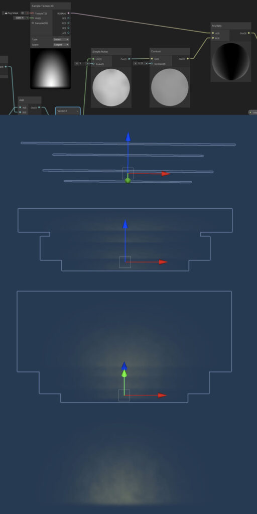
 It’s a not-so-dirty not-so-secret that even in high-end film compositing software volumetric lighting is faked by slicing the camera’s Z-axis into stacked, transparent planes at render time. This is what Shrooms does manually. Using the limited camera view and careful placement, patches of fog are created with a shader on a small stack of transparent planes. The shader multiplies a half-circle gradient alpha Texture with a procedural noise function. The noise slowly migrates up the Y-axis, as if mist were rising off the swamp. The noise is generated in World Space, so that scaling, squashing or stretching the fog planes creates no distortion to the noise pattern.

Light glows work the same way. Each light fixture model contains a set of three  planes: Two larger, colored, more transparent ones in front and back, and a smaller, more opaque, white plane in the center. The alpha Texture is a narrow cone gradient, aimed downward, and the World Space noise function slowly falls, like misty drizzle. The bright spotlights in the arena and cafe are just variants on this scheme, and a circular glow is used in a couple of additional spots.

Shrooms: Color & Forms

In Niek Meffert’s concept for Shrooms, giant mushroom people battle giant plant people in their swampy homeland, while grinding the remnants of humanity under their figurative boots. The dev team was Meffert, Lucas Oliveira, Sabrina Christiansen, Kaspar Dahl, Natasha Beck, and myself as Lighting Designer and Technical Artist. You can check out the demo (Mac & Windows) on Itch.io here.

Frequently heard during environmental modeling: “It’s good, Sabby. Get rid of the straight lines.”

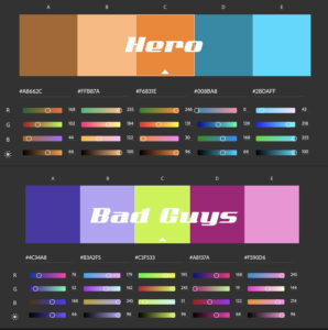
The objective was to create a bright, colorful, murky, fungal setting. Fungus suggests bright, “sickly-sweet” tertiary colors, and we wanted an organic, lively scene. However, with too much clashing color the scene would have become busy and unreadable. Just finding your way and knowing what to interact with would have meant a frustrating cognitive load.

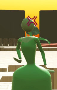
For that reason, I worked with the team to enforced certain rules to control user attention. The main character is in complementary colors. The bad guy’s color palette is a high-saturation split complement. NPC characters each have a single, dominant color. Non-interactive parts of the scene favor muted, analogous colors.

Lighting rules were also held to. Unimportant parts of the level fall back into mist and shadow. The character path is comparatively well lit, always suggesting where the player can and can’t go. Interactive parts of the scene (usually just-for-fun destructibles) pop comparatively, while others harmonize.

Forms avoid straight lines, with blobby, asymmetrical and impractical shapes but—importantly—recognizable outlines. Classic Warcraft games, and the art of Chris Sanders (Lilo & Stitch) were strong references here.

And of course, what’s the point of a game without asshole physics?

Oh Steam…

Kubrick twist: Searching Steam aliases is notoriously broken! This seems to be a known issue that’s been causing consternation for half a decade. Specifically, aliases with trailing numbers (e.g. spacetoast123) are unfindable with the exact string, and usually with a partial string.

So, while I’ve been able to send a friend request to the Second Prize raffle winner ($25 USD), who has no trailing numbers, nothing I’ve tried has brought up profiles for the First and Third Prize winners ($75 and $25, respectively).

If you entered the raffle, and your Steam alias ends in numbers, please friend me via my public profile page: https://steamcommunity.com/id/rhinocrate/ Over 300 hours of Civilization VI? Yes, it’s a problem. Regardless, you may have already won! I promised not to post handles publicly (and creating a duplicate with the same alias seems quite easy) so winners can’t be directly announced.

Bottom line: If you ever run a stunt like this yourself, even though it might make you look spammy, get an email too.

Raffle Code

As promised, I’ll be raffling off one $75USD Steam digital gift cards, and two $25 cards shortly. Just to be super transparent, here’s the raffle code.

And no, I’m sure mathematically this wouldn’t hold up in a real lottery–but for a raffle with fewer than 20 valid entrants, I think we can call it good.

function rankRaffleEntrants(){
        var entrants = "Prima Secunda Tertia Quarta Quinta Sexta Septima Octavia Nina Decima"; //Steam handles
        entrants = entrants.split(" ");
        ol = document.getElementById("orderedList");
        //print function
        function addToList(entrant){
          var li = document.createElement('li');
          var nextInList = document.createTextNode(entrant);
          li.appendChild(nextInList);
          ol.appendChild(li);
        }
        while (entrants.length>1){
          var pick = Math.round(Math.random()*(entrants.length-1));
          var entrant = entrants.splice(pick,1);
          addToList(entrant);
        }
        addToList(entrants[0]);
      }