By virtue of their printed size, long-form (Sunday) comics have a history of being difficult to translate into book form. Newspaper widths vary between about 11″x17″ (tabloid) and 18″x24″ (broadsheet), while trade paperbacks much above 8.5″x11″ (letter) become expensive to print and hard to move through retail channels. In order to allow reprinting in smaller formats and in different shapes, the modern comics page is dominated by comics with simple art and a large number of small panels. Meanwhile, dedicated comic books, which can be reprinted at the same scale and dimensions in trade paperback, have grown ever more complex and detailed. Sunday comics with ongoing storylines have disappeared, while comic book storylines grow ever richer.
Lets find a different Sunday strip format that’s easier to reprint in book form.
We assume that each artist should get the same amount of space in each edition, and that the artwork should be reproduced at roughly the same size in newspaper and book form.
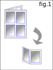
The simplest method would be to print four standard comic book pages on each page of newsprint (fig. 1), for a total of 16 comics per sheet (bifold: cover, inside left, inside right, back). Reprinting is a question of slicing each full-size page into four book pages. 
Fine. Boring. The newspaper sheet looks like a set of unrelated items stuck next to each other.
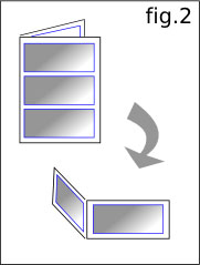
We could also do three landscape-oriented pages per sheet. (fig. 2) This would give the artist more space to work with. Reprinting would require a landscape-oriented trade paperback though, which is harder to shelve. It’s also just as boring. 
If we’re reinventing the Sunday comics page, let’s come up with something more interesting.
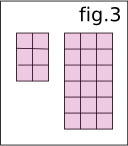
We’ll start by dividing the page into blocks. Each page of the trade paperback gets six blocks (2×3), each page of the newspaper, eighteen (3×6). (fig. 3) The blocks need not be square, but they can’t be rotated between newsprint and trade, and need to maintain a consistent aspect ratio. 
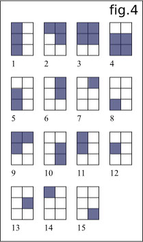
We now combine the blocks into shapes. These shapes become the working space each artist is given. Since the shapes won’t be divided up further in reprinting, the artist has freedom to use the space in any way desired — panels of all shapes and sizes, or no individual panels at all. A 2×3 block trade paperback page can be divided into fifteen pairs of contiguous shapes. (fig. 4) 
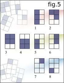
Shapes that result in an ambiguous visual flow (spots with no clear left-to-right/top-to-bottom progression) have to be discarded. This leaves us with eight shape combinations. (fig. 5) 
Our goal is to give each artist the same amount of space per issue. With twelve artists per sheet of newsprint, each artist gets two sets of blocks to work with, totaling six blocks.
The eight shape sets break down into three basic categories:
- Two shapes of the same size (1 & 2)
- One shape with four blocks and one shape with two blocks (3, 4, 5 & 6)
- One single block and one shape with five blocks (7 & 8)
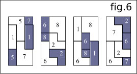
When we take the eight basic shape pairs and start trying to fit them into the 3×6 grid of the newspaper page, we begin to notice things. (fig. 6) It’s almost always possible to randomly choose one of each category and fit them together in a nice jumble, without any two shapes being fitted together in the same manner they would be in the 2×3 trade paperback. Shape pairs 3 and 4 tend to cause the exceptions, especially with 7s and 8s, often being either impossible to fit into the grid, or only working in their original positions. Neighbors in general don’t tend to work well (2/3/4, 3/4/5, 6/7/8, etc.). A great variety of interesting layouts are allowed.

As long as each artist is given two locations in each issue with a total of six blocks between them, each newsprint issue can be reprinted in book form without any alteration to or significant scaling of the original artwork. An attractively jumbled layout is produced, both for the Sunday newsprint edition and in book form.

